Some football partnerships become part of the furniture. Adidas and Germany, Nike and Brazil, Puma and Italy for much of the modern era. Le Coq Sportif’s relationship with the Azzurri was nothing like that. It lasted only from 1980 to 1984, but in those four years the French brand produced one of the cleanest, most memorable national-team shirt runs in football history, and happened to be there for a World Cup win too.
What makes the period so interesting is how little Le Coq Sportif seemed to need to say. The shirts carried no visible manufacturer branding, the blue was left almost completely alone, and most of the identity came from the crest, the number and, later, the smallest touches of tricolour. In an era now obsessed with storytelling, references, patterns and campaign films, there is something very refreshing about shirts that simply trusted the colour.
That simplicity also means the small changes matter more. Across the four years, Italy’s shirts barely moved away from the same basic idea, yet the collar, the crest and even the way the numbers were applied tell the story of the partnership surprisingly well.
1980: The Beginning
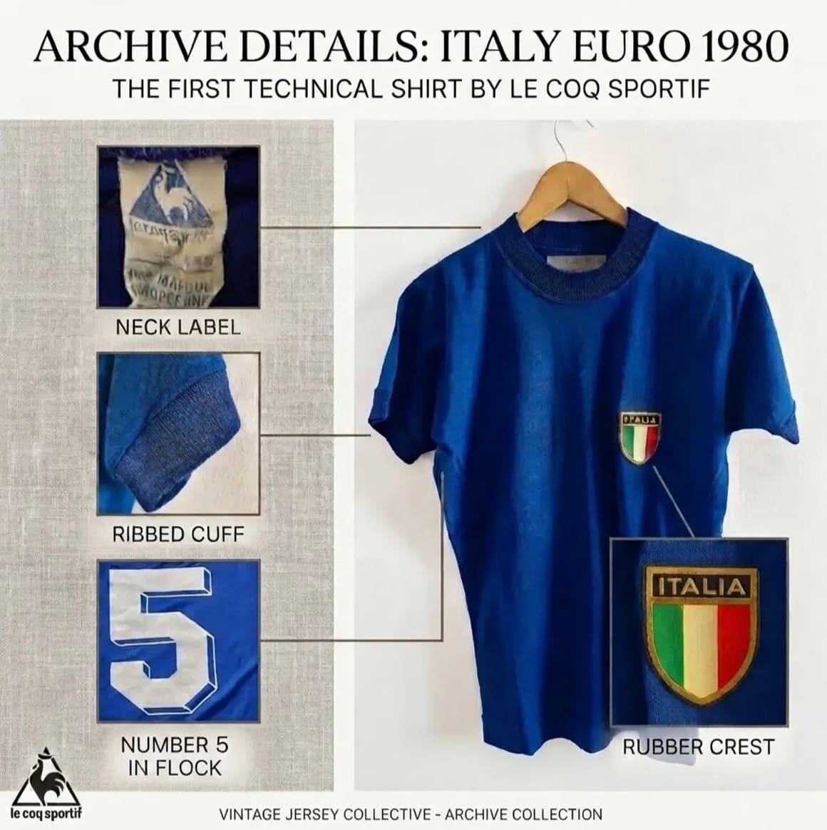
Italy entered the 1980s with a new technical supplier and a shirt that was almost stubbornly plain. The Euro 1980 home jersey had a royal-blue body, ribbed crew neck, matching cuffs and the traditional Italia crest sitting on the chest. There was no Le Coq Sportif logo on show, no pattern in the fabric and nothing trying to pull attention away from the fact that this was, first and foremost, an Italy shirt.
The more interesting details sit in the construction. Depending on the venue and fixture, different player shirts featured different numbering techniques. The group-stage matches in Milan and Naples used Le Coq Sportif-tagged shirts with flock-printed numbers, while the games against England in Turin and Belgium in Rome featured tagless versions with more traditional felt numbering.
That kind of inconsistency is part of what makes older shirts so interesting now. Modern football kits are documented, standardised and replicated down to the smallest detail. In 1980, two shirts from the same tournament could differ in ways that now have collectors comparing labels, fonts, materials and stitching just to work out where they came from.
1982: The Shirt That Won the World Cup
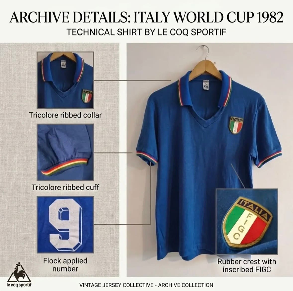
By the time Italy arrived in Spain two years later, Le Coq Sportif had found a way to make the shirt feel more distinctive without really making it busier. The crew neck disappeared and was replaced by a V-neck with a fold-over collar, edged in green, white and red. The same tricolour trim ran around the cuffs, while the crest was updated with FIGC set vertically through the white stripe. It was still an extremely simple shirt, but those few additions gave it a sharper, more recognisable character.
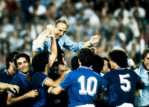
Then Italy won the World Cup in it. That is obviously doing a fair bit of work for the shirt’s reputation, but the design deserves plenty of credit of its own. Paolo Rossi scored six times, Marco Tardelli produced the celebration that still gets replayed whenever anyone wants to explain what winning a World Cup feels like, and Dino Zoff lifted the trophy after the 3-1 win over West Germany in Madrid.
The shirt became part of all of it. The royal blue, the small tricolour trim, the crest, the lack of branding, it is now almost impossible to see one without thinking of Bearzot’s side.
1983/84: Three Stars Change Everything
After the World Cup, the shirt evolved again, but still without losing the restraint that had defined the whole Le Coq Sportif period.
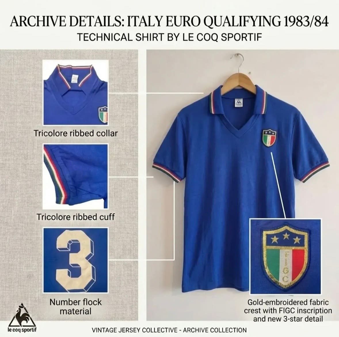
The V-neck, collar and tricolour cuffs remained, but the badge now carried three gold stars above the shield, marking Italy’s World Cup victories in 1934, 1938 and 1982. It is a tiny addition, but it changes the mood of the shirt completely. The earlier versions had felt almost anonymous in their simplicity, while this one suddenly carried a very obvious sense of status.
The rest of the design was left alone, which is probably why the stars have so much impact. There was no need to build an entire visual language around the achievement; the crest was enough.
Le Coq Sportif’s spell with Italy ended in 1984, around the same time the FIGC moved towards another new identity. In purely chronological terms, it was a very short partnership. In shirt terms, it is difficult to think of many four-year runs that packed in quite as much.
Why This Era Still Looks So Good
It is easy to be generous to old football shirts. Give almost anything thirty or forty years and a little grainy television footage and somebody will eventually call it a classic. But that's not quite what is happening here.
These shirts still look good because they knew when to stop. The blue did most of the work, the crest was allowed to matter, and the tricolour appeared only when it genuinely improved the design. Even the progression from 1980 to 1984 feels measured rather than forced. A new collar here, a change to the crest there, three stars when the history justified them.
There is also something unfussy about the whole relationship. Le Coq Sportif never seemed desperate to make the shirts look unmistakably Le Coq Sportif. They looked unmistakably Italian instead. That's great design and it's why the partnership has aged so well. The shirts don't really feel like products of a brand campaign or even particularly like products of the early 1980s. They feel like Italy shirts, made at a point when the manufacturer understood that sometimes the best thing you can do is leave the identity alone and get the details right.
And over four years, Le Coq Sportif got almost all of those details right.
Research by Giampabon.