The Strange Story of Japan’s Flame Kit: One Shirt, Three Manufacturers.
There are football shirts that become so closely associated with a manufacturer that the two are almost impossible to separate. Denmark in 1986 and Hummel. The Netherlands in 1988 and Adidas. Brazil in 1998 and Nike. The logo on the chest becomes part of the memory, part of the mythology and, eventually, part of history.
Japan’s flame kit from the late 1990s is different because, in a sense, it belonged to nobody but Japan.
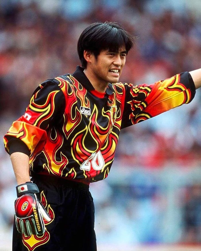
Most people remember the version worn at France ’98, the country’s first ever World Cup, and that means most people remember it as an ASICS shirt. That is understandable. The ASICS logo sat opposite the JFA crest on the outfield shirt and, more memorably, on Yoshikatsu Kawaguchi’s extraordinary black goalkeeper jersey, covered almost completely in red and yellow flames. It is one of those shirts that barely needs an introduction now. Even people with only a passing interest in football kits tend to know it.
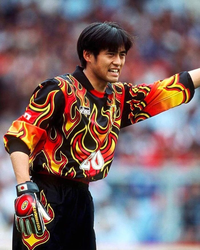
The problem is that calling it an ASICS design does not really tell the story. Versions of the same broad identity also appeared with Puma and Adidas logos. For a brief period, three rival manufacturers effectively took turns producing kits that remained recognisably part of the same visual family. In modern football, where kit contracts are fiercely protected and every design is tied to a supplier’s brand language, that feels almost impossible.
To understand how it happened, you have to go back to a moment when Japanese football was reinventing itself.
The J.League launched in 1993 and immediately looked unlike most established leagues in Europe. There was a sense that the new professional game in Japan was not interested in copying what already existed. Clubs arrived with new names, new badges, new mascots and kits that were often gloriously excessive. Mizuno, in particular, produced some of the most memorable early J.League shirts, full of geometric patterns, clashing colours and designs that seemed built to grab attention.
That broader visual culture mattered. The Japan Football Association was operating in the same world, and the national team’s kits became more adventurous too. The shirts associated with the 1992 Asian Cup and the failed attempt to reach USA ’94 were already far removed from the plain designs that had come before. Blue remained the base colour, but there were bold white shapes, red detailing and a sense that the shirt was now being treated as part of a wider national identity rather than simply as a uniform.
The timing was significant. Japan won the Asian Cup for the first time in 1992 and then, a year later, suffered one of the most painful moments in the country’s football history. In Doha, they conceded a late equaliser against Iraq and missed out on qualification for the 1994 World Cup. The “Agony of Doha” became a national reference point, not just because of what happened on the pitch, but because of what qualification had come to represent. Japan had a new professional league, a rapidly growing football culture and a national team that now believed it belonged at the World Cup.
By the middle of the decade, the shirt had changed again.
The geometric pattern disappeared and the new design became much cleaner through the body. The drama moved to the shoulders and sleeves, where flames were introduced. The JFA dates the appearance of the senior national-team version to 1996, while similar flame designs were also used across other Japanese representative sides during the same period, including the Olympic team.
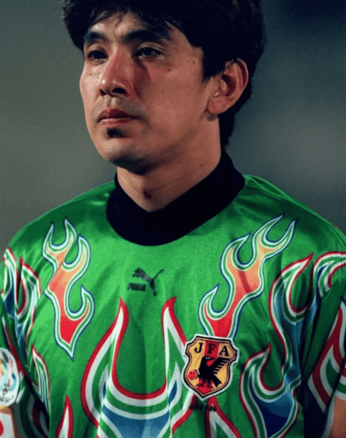
This is where the story gets particularly unusual. The JFA was not simply taking a finished design from a sportswear brand in the way we would expect now. Instead, the association controlled the broader identity and different manufacturers produced versions of it. That is why you can find Japan flame shirts from this period with ASICS, Puma and Adidas logos and still immediately recognise them as part of the same design family.
The manufacturer changed. The identity remained.
That arrangement had existed before the flame shirt too. Japan’s earlier early-90s design appeared beneath different brand logos, reflecting a supplier setup that was far more fluid than the exclusive contracts that dominate international football today. The flame shirt simply became the most memorable expression of it.
There has always been a lot of discussion around what the flames were supposed to represent. The most widely repeated explanation connects them to Fudō Myōō, a Buddhist deity commonly depicted surrounded by fire. In that tradition, the flames are associated with purification and the destruction of worldly obstacles. It is an appealing explanation, particularly given the moment Japanese football was entering, but it is worth being careful with it. The connection is widely cited, though the exact original JFA design brief is not particularly well documented.
What is beyond doubt is that the flames gave Japan a visual identity of its own. The outfield shirt was actually quite restrained by the standards of the decade. The body remained predominantly blue, the collar was simple and the pattern was concentrated around the shoulders. It was distinctive without being chaotic.
Then there were the goalkeeper shirts.
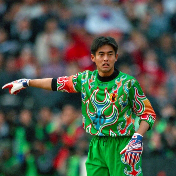
If the outfield version showed restraint, the goalkeeper kit did the opposite. The black shirt worn by Yoshikatsu Kawaguchi at France ’98 took the flame motif and allowed it to spread across almost the entire jersey. Red and yellow flames rose from the bottom of the shirt, wrapped around the sleeves and crowded the torso. There were green versions too, using a wider palette but retaining the same sense of excess.
It is the sort of design that makes perfect sense only in the context of 1990s goalkeeper shirts, when manufacturers seemed to operate under the assumption that the man in goal should be visible from space. The decade produced neon patterns, giant sublimated graphics and enough abstract geometry to fill an art school prospectus. Even within that context, Japan’s flame shirt stands out.
Kawaguchi helped turn it into something bigger than a piece of kit. Japan lost all three of their group games at France ’98, but the tournament still mattered enormously. This was the country’s first World Cup, the moment when a generation of supporters around the world saw Japan on football’s biggest stage. Hidetoshi Nakata was there, already carrying the sense that Japanese football was about to become much more visible internationally, and Kawaguchi’s goalkeeper shirt became one of the enduring visual memories of the tournament.
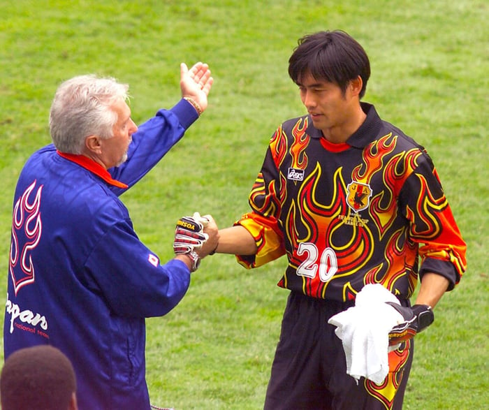
The outfield shirt had already been part of another important story before Japan arrived in France. During the qualification campaign, Adidas-branded versions of the flame design were worn as Japan finally achieved what had eluded them four years earlier. Qualification was difficult, and manager Shu Kamo was replaced midway through the campaign, but everything eventually came down to a play-off against Iran in Johor Bahru.
Japan won 3-2 after extra time, with Masayuki Okano scoring the golden goal that sent the country to its first World Cup. For Japanese football, it was one of the defining moments of the decade. The flame shirt was now tied not only to a striking design, but to the breakthrough the entire football culture had been building towards.
What makes the story even better is that the Adidas logo was gone by the time the World Cup itself began. ASICS took the turn for France ’98, and the same broad visual identity continued beneath a different logo. The shirt was still Japan’s. The manufacturer was almost incidental.
For collectors, that makes the flame era a wonderfully confusing rabbit hole. The same visual language exists across different manufacturers, competitions and national age groups. There are outfield shirts, goalkeeper shirts, Olympic versions, senior-team versions, youth versions and subtle changes in collars, flame size, detailing and construction. A collector seeing two similar Japan shirts with different brand logos might reasonably assume that one must be wrong. In this case, the inconsistency is part of the history.
That is one of the reasons these shirts are so interesting to collect. They reward context. You need to know what you are looking at, because the manufacturer alone does not tell the full story. The badge, the cut, the competition markings, the style of the flame pattern and the team that wore it all matter.
The goalkeeper shirts sit at the top of that particular hierarchy because they are both rare and visually extraordinary. The black France ’98 version has become especially desirable, but the green variants and earlier branded versions are equally fascinating. What looks at first glance like one famous shirt becomes an entire ecosystem of related pieces.
The era did not last.
From 1999 onwards, Adidas became Japan’s long-term supplier and the unusual rotation between competing brands effectively disappeared. Japan’s football identity became more conventional in commercial terms, even if the shirts themselves continued to take design risks. Adidas has since produced some outstanding Japan kits, but the relationship has been much more familiar: one federation, one supplier, one recognisable partnership.
That is partly why the flame shirts now feel so special. They come from a moment when Japanese football was still defining what it wanted to be, both on and off the pitch. The J.League was new. The national team was still chasing its first World Cup. The visual language was bold, experimental and confident enough to belong to the JFA rather than to any single sportswear company.
The fact that Adidas and Kith have recently revisited the black flame design is a nice piece of circular history. The shirt most people remember as an ASICS World Cup classic has been reinterpreted by Adidas decades later, which would be a strange move if the original story were simple. It is not simple. That is exactly why it remains interesting.
The flame kit is usually remembered because it looks brilliant. That is reason enough to love it. But the better story is what sits behind the design: a national team moving towards its first World Cup, a football culture developing its own visual identity and three competing manufacturers producing variations of a shirt that none of them fully owned.
It looked like an ASICS shirt in France. It looked like an Adidas shirt during qualification. Elsewhere, Puma had its turn too.
Really, though, it was always Japan’s.
Research by Giampabon. If you'd like to explore more classic Japan football shirts you can do so in-app at the Showboat marketplace or on our website here.