We've seen a fair few shirts in our time. In fact, we've seen around 15,000 of them in the last week alone after you lovely bunch uploaded your collections in their thousands to the Showboat app. Which is a long-winded way of saying, we know a good shirt when we see one and we know a bad shirt when we see one. We think we have taste, in other words.
We're also not prone to hyperbole here at Showboat. So when we commit the words 'Bournemouth Release Worst Shirt of the Season' to paper, then you can be sure we're going to stand by them. This isn't talkSport where you're allowed a hot take every ten minutes and nobody remembers the last one. No sir.
We don't think we'll be revising this in a month's time.
Bournemouth have committed multiple offences here. Shirt crimes, crimes against fashion, crimes against our eyes. It's a straight-red and a six-game ban with the potential for an extension.
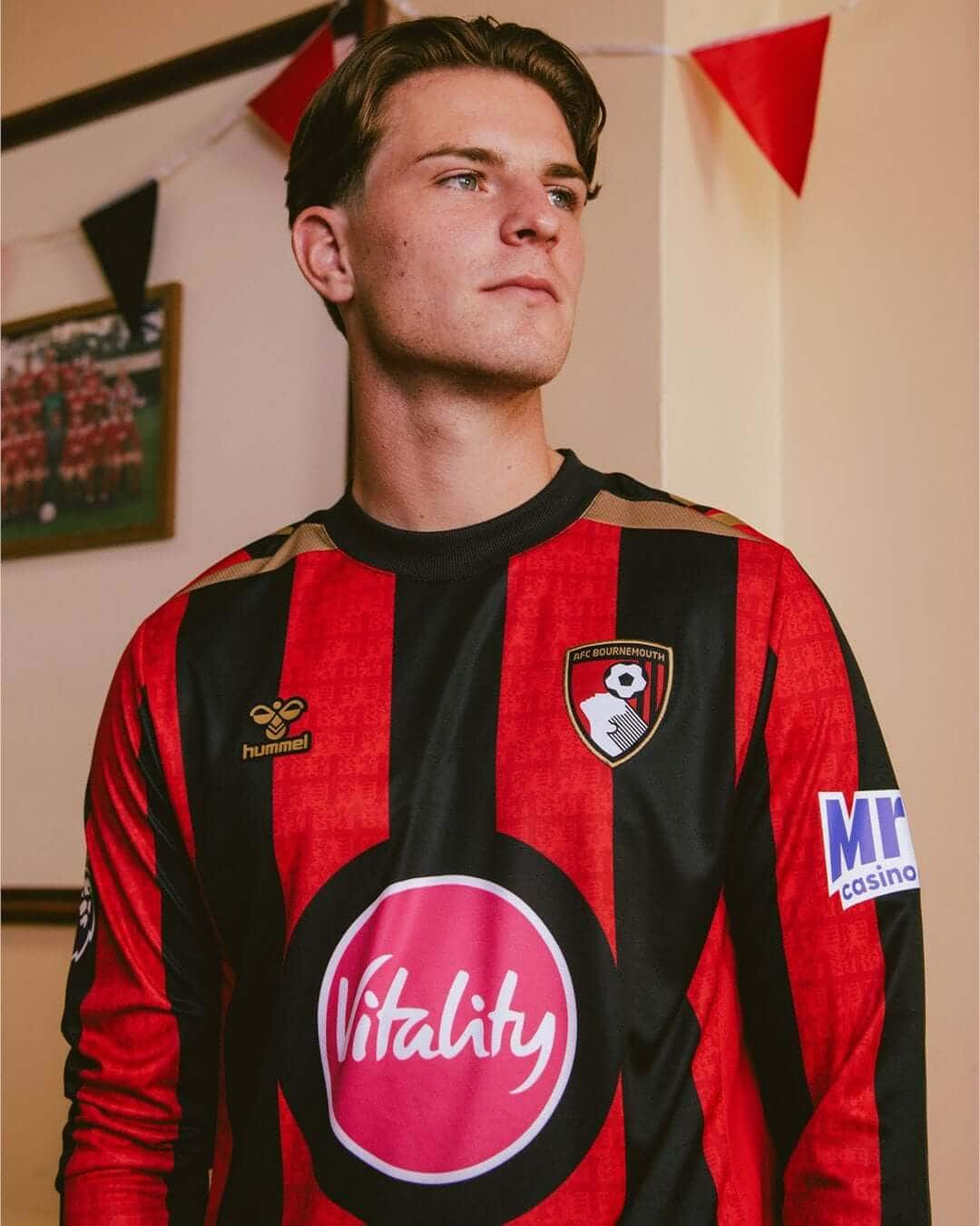
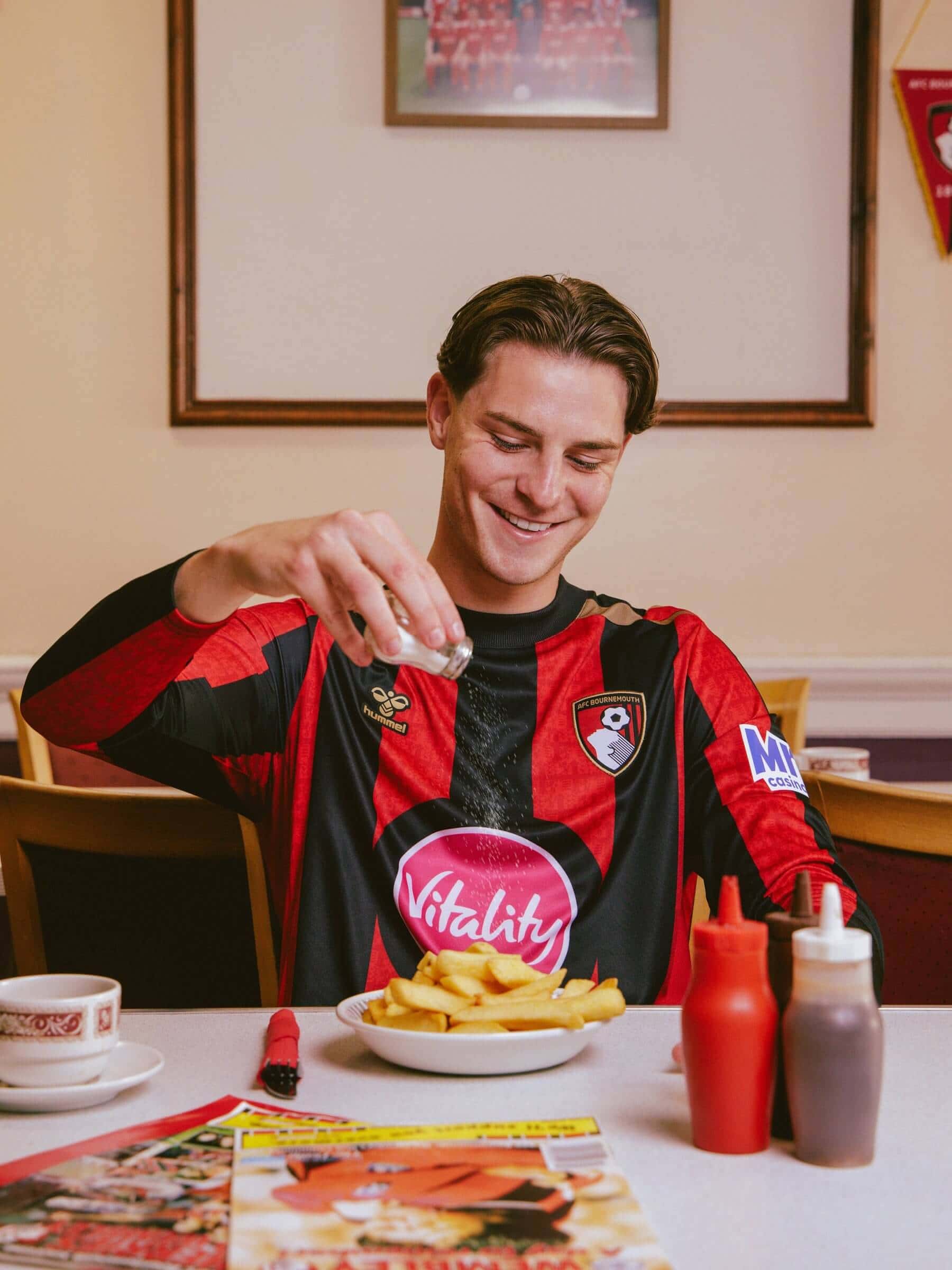
Where you start with a shirt this bad is hard to say. Our eyes are drawn all over the place, as though we’re watching doubles at Wimbledon. And drinking them at the same time. The horrific big pink buzzer in the middle of the shirt is probably the best jumping-off point. We can’t work out whether that’s a frying pan with the word Vitality in it or something more sinister.
But the fun doesn’t stop there. We’ve got Mr Q Casino, who’s turned up for the fun and games. Because we all know that if you’ve got a health sponsor on the front of your shirt, you need a bit of betting on the arm. Similarly, Mr Q Casino decided it would complement the red and pink on display with a nice shade of blue.
There has been zero pushback from the club on the colours used by its betting partner, which is a real shame because it can be done. Ultimately, the club calls the shots here. We’ve worked on these processes ourselves. They could go to bat for the fans. They’ve chosen not to.
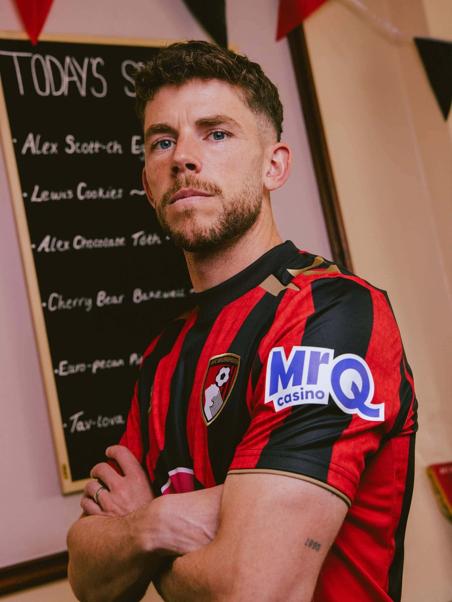
Equally, let’s not let Hummel off the hook here. Black, red, pink and blue is not a colour scheme you’d expect to see anywhere. To then try to tie them together with gold trim is something you’d only expect to see in the White House.
And in a last-ditch attempt to grab some street cred, Bournemouth apparently held the photo shoot in a greasy spoon, though it looks more like the club lounge. It’s a desperate attempt to appeal to the common man, as though he’s going to look at that rubbish and think, “I want a bit of that.” We’re talking about the shirt, not the delicious chips.
From top to bottom, this is a horror.
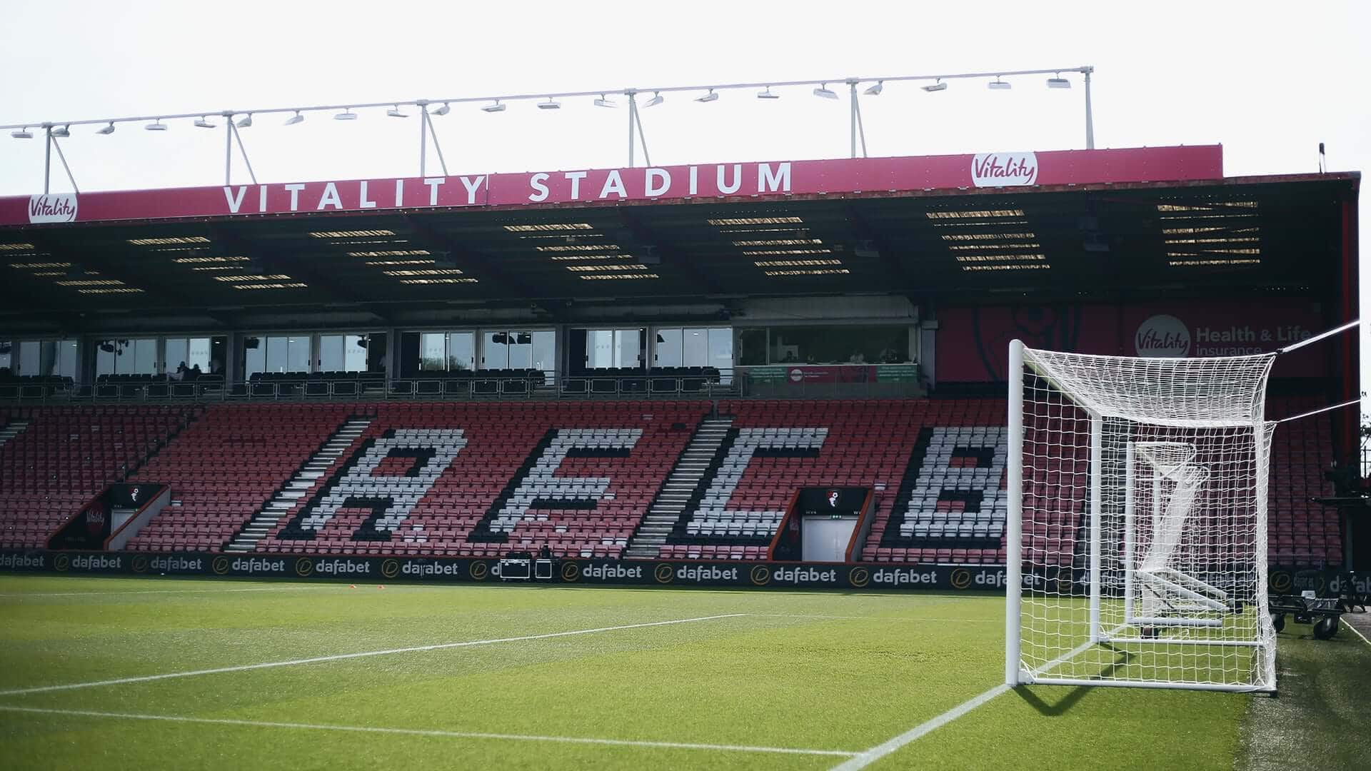
But Bournemouth do have a lot of form here. Last season, they had the ungodly ‘BJ88’ plastered on the front of their shirts. Two years before that, it was Dafabet. We get it: clubs want the money to compete. We just don’t think they should give these companies free rein to bastardise club shirts in the process.

You can find proper football shirts in the Showboat app in the marketplace or one our website here.