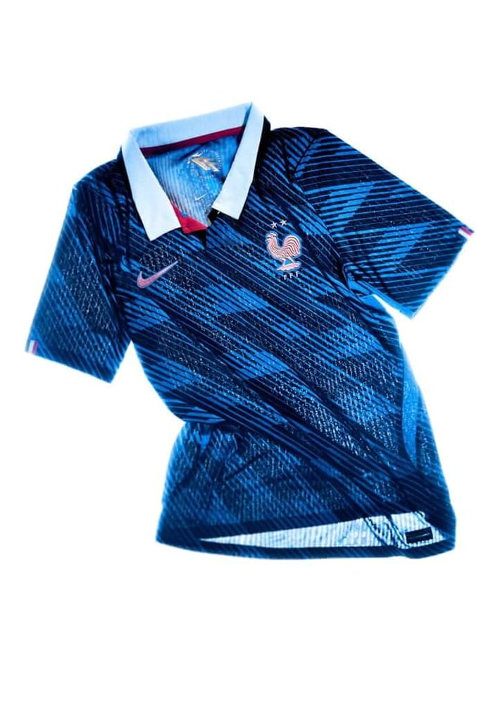
France (Home)
France rarely shout when it comes to design, and this shirt doesn’t either. At first glance it’s a familiar blue, but the details reveal something more deliberate. The white collar introduces a sense of refinement that feels closer to tailoring than sport, subtly reworking the tricolour without leaning on it. Across the fabric, a barely-there pattern adds depth, creating the impression of movement as the shirt catches the light. It’s a design that unfolds rather than announces itself. The metallic crest sharpens everything, bringing a modern edge to a silhouette rooted in tradition. There’s a confidence in the restraint, a sense that the shirt doesn’t need to prove anything. It simply sits there, composed, carrying the weight of a team that has long defined its own style.
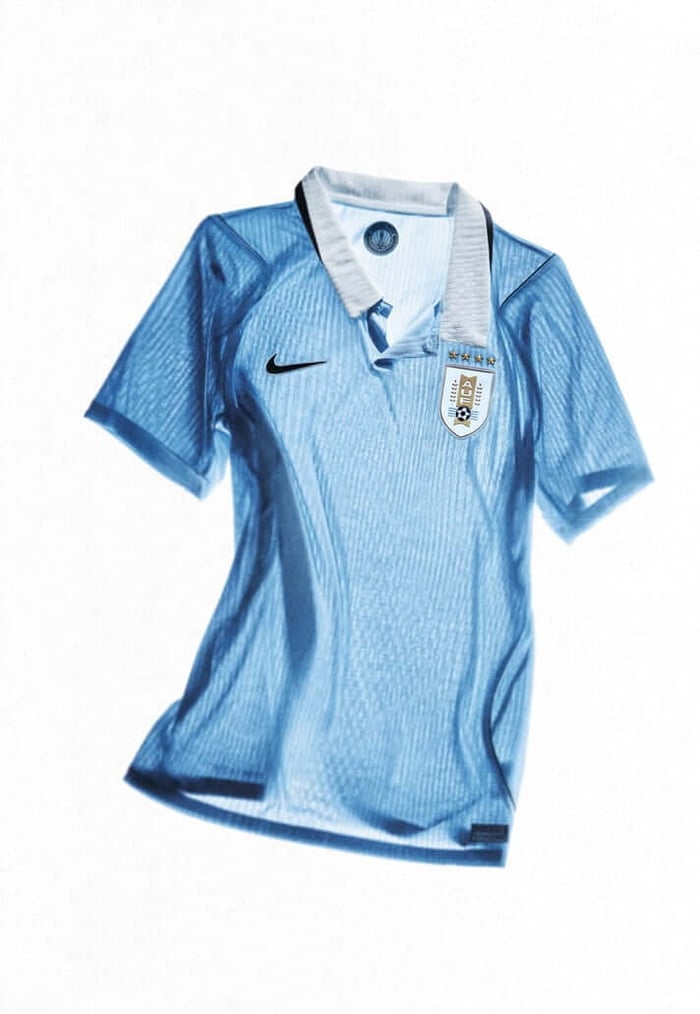
Uruguay (Home)
Uruguay rarely stray from what they are, and this shirt understands that. The sky blue remains untouched at its core, clean and immediate, carrying more history than most designs need to explain. Around it, small adjustments do the work. Navy accents frame the shirt, tightening the silhouette and giving it a sharper, more modern edge without disturbing the balance. It’s a kit built on restraint, where simplicity isn’t a lack of ideas but a decision in itself. That mirrors the team. Disciplined, structured, rarely distracted. There’s no excess here, no attempt to reinvent something that doesn’t need it. Just a refinement of what has always been there. Honest football, translated into fabric.
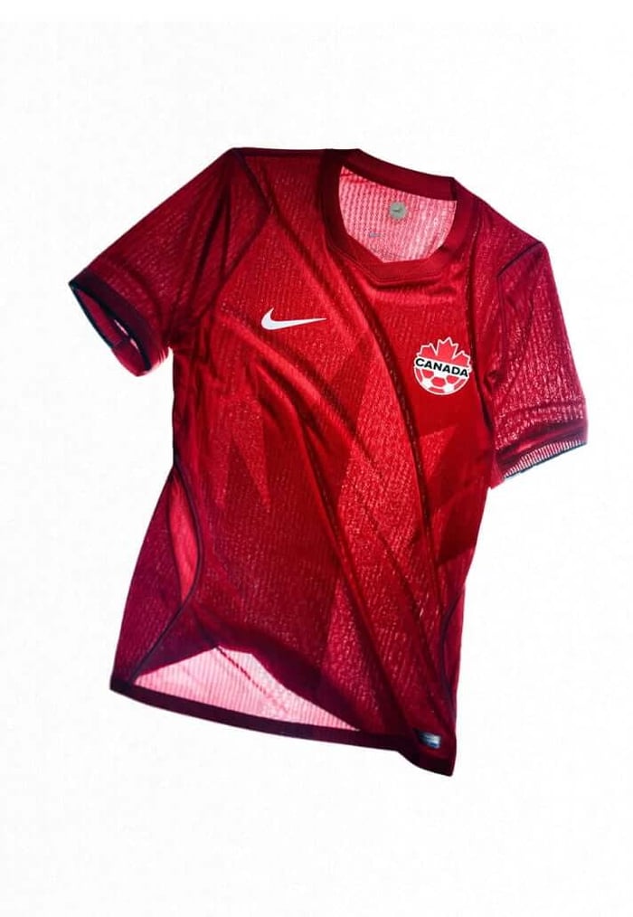
Canada (Home)
Canada’s home shirt centres itself around a single idea and commits to it fully. The maple leaf sits front and centre, split-toned and sharpened, less a decorative detail and more a statement of intent. It points north, deliberately so, tying the shirt to both geography and identity. The rest of the design follows that lead. Subtle references to outdoor apparel bring a sense of function to the shirt, with textures and finishes that feel built rather than styled. It’s a kit that leans into Canada’s environment as much as its footballing future. There’s a quiet confidence in it, a sense of a team still defining itself but doing so on its own terms. Nothing feels excessive. Everything feels considered.
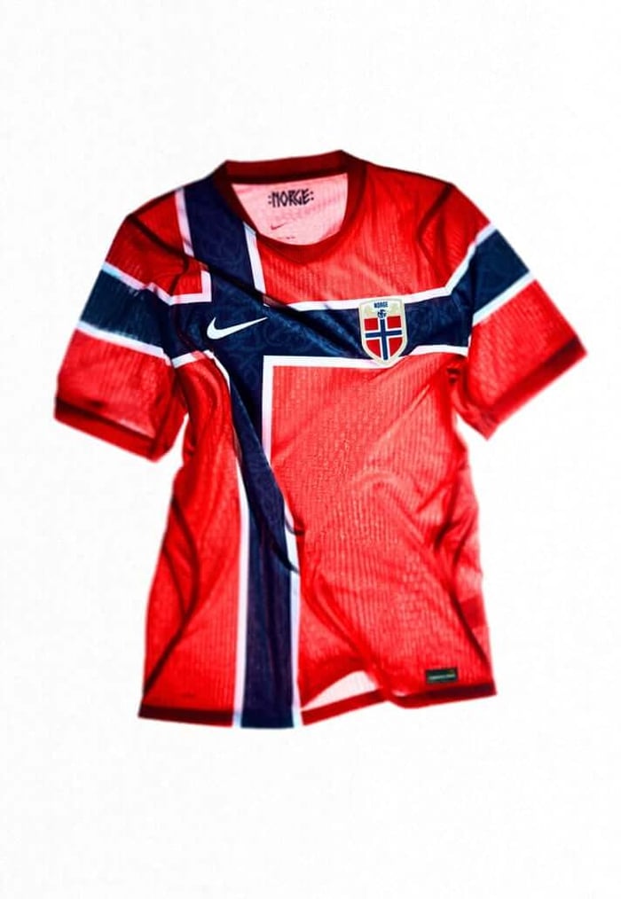
Norway (Home)
Norway’s home shirt works within a familiar frame but adds something beneath it. The red base holds steady, as it always does, while the blue detailing draws directly from the flag, anchoring the shirt in national identity. Within those stripes, a tonal graphic begins to emerge. Inspired by Urnes-style Viking patterns, it sits just below the surface, visible only as the shirt moves. It’s a quiet nod to history rather than a dominant feature. That restraint gives the shirt its strength. It feels grounded, tied to something older, but not stuck in it. Norway’s presence on the international stage is still growing, and this kit reflects that. Confident, but measured. Looking forward without losing sight of where it comes from.
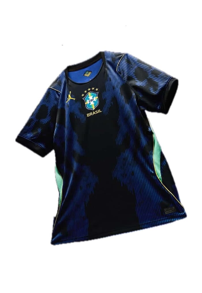
Brazil (Jordan Away)
There’s a different tone here. Where Brazil’s home shirt leans into expression, this one carries something heavier. The palette darkens, pulling the identity into a more controlled space, while the surface introduces layered graphics that feel closer to skin than fabric. The elephant print sits at the centre of it, distorted and uneasy, giving the shirt a sense of unpredictability. It draws from the Amazon, but not in the obvious ways. This isn’t about beauty alone, it’s about tension. The balance between elegance and threat. Jordan Brand pushes Brazil into a different register here, one that suggests control as much as flair. A reminder that dominance doesn’t always need to be loud.