River Plate 125th Anniversary Shirt Gets Almost Everything Right
The River Plate 125th Anniversary Shirt had an easy way to fail. Like so many commemorative releases, it could have been overloaded with gold trim, hidden references and enough anniversary branding to make it feel more like a souvenir than a football shirt. Instead, adidas have taken a far more restrained approach and the result is one of the strongest special releases we've seen in years.
Clubs understandably want to celebrate their history, but too often that leads to kits overloaded with references, hidden details and enough gold trim to make them look more like commemorative souvenirs than football shirts. River Plate and adidas have taken a different route for the club's 125th anniversary and the result is one of the strongest special releases we've seen in a while.
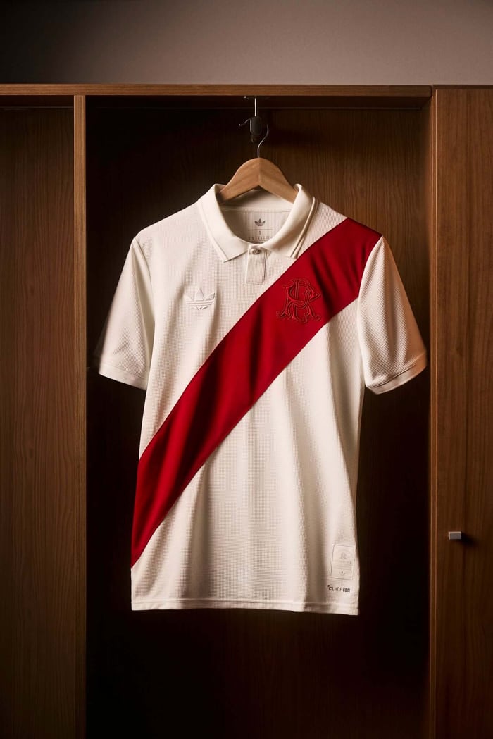
At first glance, there's nothing particularly radical about it. The shirt arrives in an off-white colourway with River's famous red sash running diagonally across the front, a design so synonymous with the club that attempting to reinvent it would have felt unnecessary. Instead, adidas have focused on refinement, borrowing from the visual language of older football shirts rather than trying to create something entirely new.
The fold-over collar is a big part of that. So too is the decision to use the Trefoil logo in place of the modern performance mark. These details aren't groundbreaking on their own, but together they shift the shirt into a different territory. It feels less like a product launch and more like something discovered in an old photograph, which is exactly the sort of atmosphere an anniversary shirt should be aiming for.
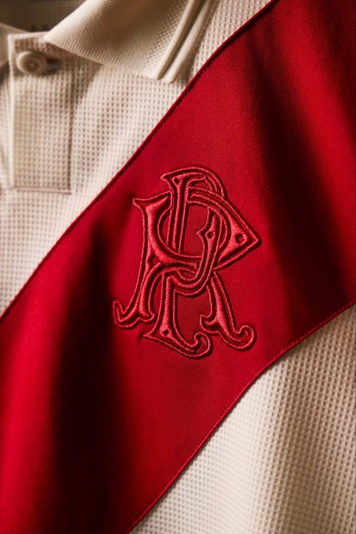
The smartest decision, however, might be the absence of the modern crest. In its place sits an embroidered "RP" monogram positioned within the sash, referencing one of River Plate's earliest emblems from 1918. It's a subtle nod to the club's past and all the more effective because it doesn't demand attention. Plenty of anniversary shirts tell you how historic they are. This one seems comfortable enough in its history not to bother.
There's a commemorative patch near the hem marking the club's foundation on 25 May 1901, while the shirt itself references the merger of Santa Rosa and La Rosales that led to River Plate's formation. Those details are there for supporters who want to find them, but they never dominate the design.
From a collector's perspective, that's what makes the shirt so appealing. The best anniversary releases tend to be the ones that understand a club's identity rather than simply its history. River Plate already possess one of football's most iconic visual signatures and adidas have wisely trusted it to carry the weight of the occasion. The shirt doesn't feel tied to a particular trend or moment, which means there's every chance it will look just as good in ten years as it does today.
Will it become a future classic? That's always difficult to predict. What feels obvious, though, is that collectors are far more likely to revisit a shirt like this than one chasing novelty. Football shirts age best when they know exactly what they are, and River Plate's 125th anniversary release feels entirely comfortable in its own skin.
Collector's Verdict
Design: 9/10
Historical References: 9/10
Future Classic Potential: High
Sometimes the smartest thing a designer can do is resist the temptation to do too much. This shirt is proof of that.