Stars, Stripes and 1994
Three decades ago the United States hosted the World Cup. Football in the country looked different then. The stadiums were full, the spectacle was huge, but the sport itself still felt like a guest rather than part of the national fabric.
Now the tournament is returning.
With the 2026 FIFA World Cup set to land across North America, Nike have unveiled the new United States men's national soccer team kits. The designs look forward to the summer of 2026, but they begin by looking back.
The reference point is unmistakable.

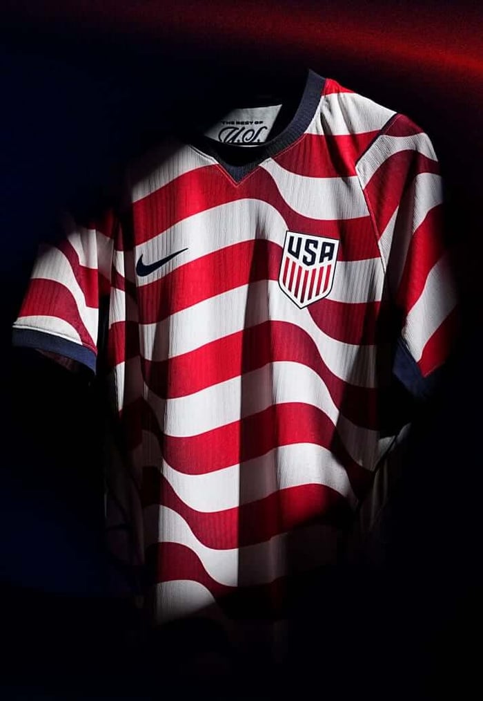
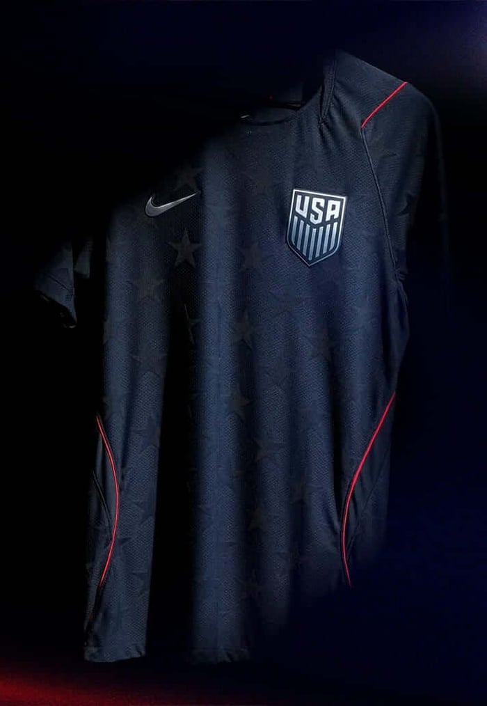
The 1994 FIFA World Cup was a turning point for football in the United States. The tournament shifted the way the sport was perceived across the country and helped lay the foundations for Major League Soccer, which launched two years later. The kits worn during that summer were bold, unmistakable and deeply American. One carried the stars. The other the stripes.
Those same ideas return here.
Nike have built the collection around two central shirts. The home kit takes the stripes. The away kit carries the stars. Both feel familiar, but neither simply reproduces the past. The patterns are cleaner. The execution sharper. It feels less like nostalgia and more like continuity.
The timing is deliberate. The shirts are expected to debut later this month in Atlanta, a city that has become one of the most energetic football hubs in the United States. By the time the World Cup arrives in 2026, these kits will have become part of the country’s modern football identity.
This launch also introduces something new beneath the surface. For the first time, every U.S. Soccer Federation national team will operate under a unified visual identity. Youth teams, senior sides and the wider national programme will share the same crest presentation and design philosophy.
There is a third shirt in the conversation too.
The goalkeeper kit continues Nike’s “Hollywood Goalkeeper” concept, first introduced in late 2025. The idea is simple. Goalkeepers should stand out again. Personality, colour and individuality returning to a position that often feels visually muted.
“A national team jersey represents the pride of wearing the crest, not just for players on the field, but also for the fans who support them every step of the way,” said Dave Wright, Chief Commercial Officer of U.S. Soccer. “With the 2026 FIFA Men’s World Cup coming to the United States, we’re excited to see players across all 27 of our National Teams and supporters across the country wearing this kit as we build toward an incredible moment for the game.”
As with most modern international releases, the design process was collaborative. Nike held workshops and testing sessions with members of the national team squad, gathering feedback on everything from seam placement to airflow and mobility. The aim was to produce a shirt that performs in the intense conditions expected during a summer World Cup.
There are quieter details too.
Inside the collar sits an “Inner Pride” mark, a hidden graphic meant to represent the internal motivation players carry onto the pitch. Typography has also been redesigned, with U.S. Soccer introducing custom kit fonts for the first time. The Stars and Stripes typefaces will appear across all national teams moving forward.
“I think between both kits there is something for everybody,” said Ronnie J. Stewart, Global Product Director at Nike. “If you want to be loud and proud and represent the crest, no one’s going to doubt who you're there for in the light kit. If you’re looking for that lifestyle look that works off the field, the dark is for you.”
Thirty years ago the World Cup arrived in America and left something behind. New leagues, new fans and a growing football culture that continues to expand.
These shirts feel like a marker of that journey. A reminder of where the game began to change in the United States and a signal that the world will soon return to see what it has become.