There is a particular kind of football shirt that makes you wonder how it ended up outside the top flight. You see it, assume it belongs to a Champions League club or one of the usual design darlings, then realise it is being worn several divisions down, somewhere the wider football world was never really looking. The US Endoume Kappa shirt for 2026/27 is exactly that kind of shirt.
Last season alone there was FC Versailles, whose blue, white and burgundy shirts became so popular that the club sold more than 10,000 of them across 40 countries and chose to carry the designs into another season rather than replace them. There was Espérance de Tunis, with a set that ranged from classic red and yellow stripes to a beautiful blue third shirt, and OGC Nice had one of the cleaner Kappa collections in Ligue 1.
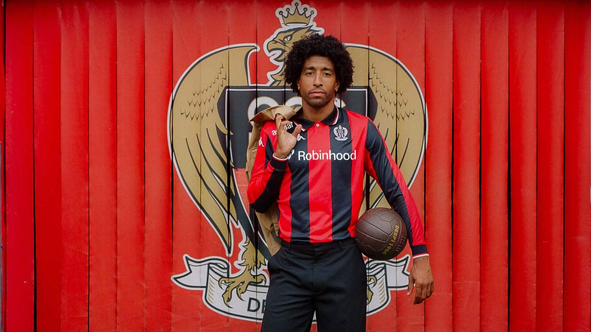
It has become something of a habit. Kappa will spend a season producing what you would expect from one of football’s great kit manufacturers, then quietly release something for a club you had not been thinking about and suddenly everybody is looking.
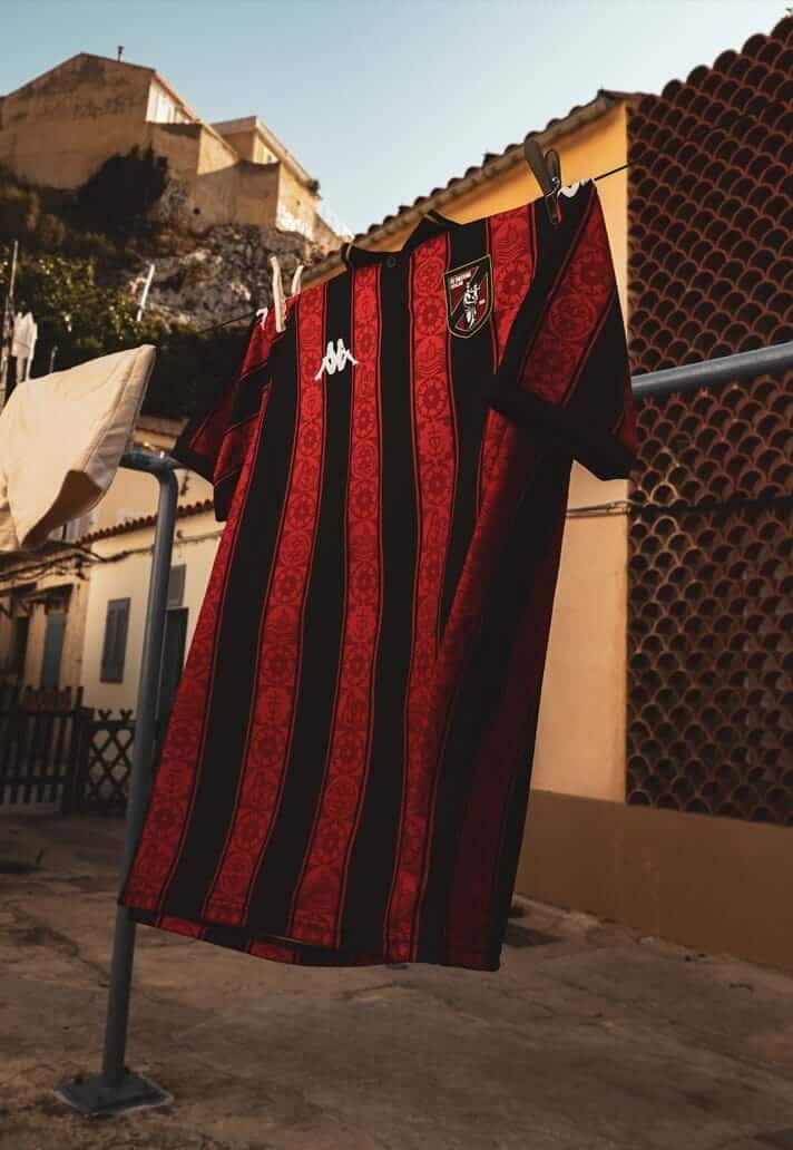
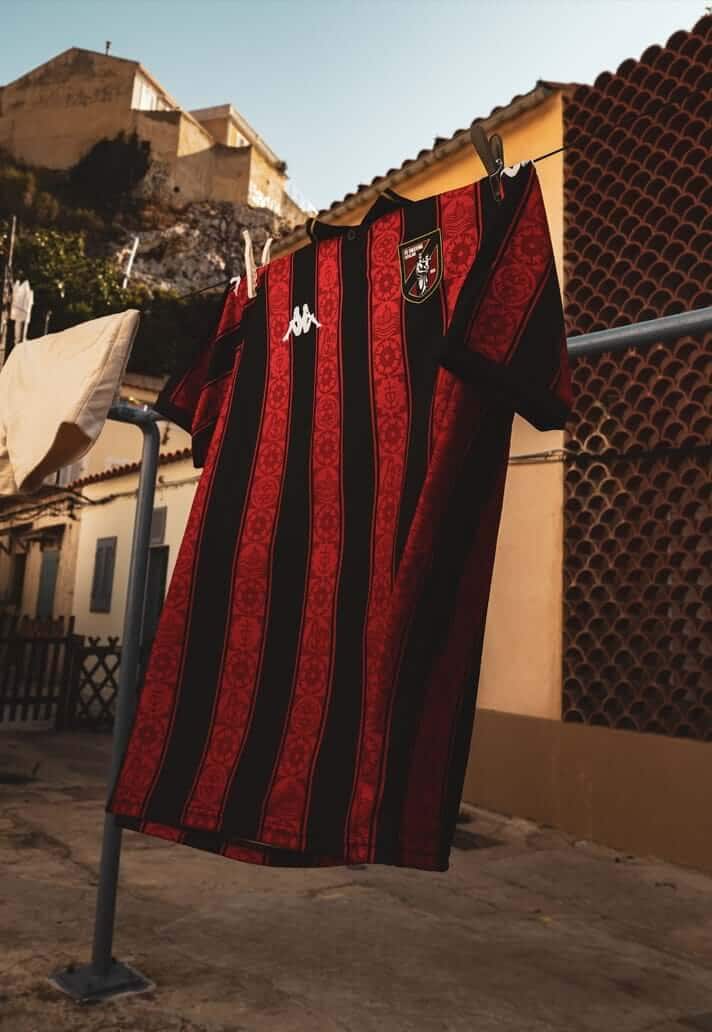
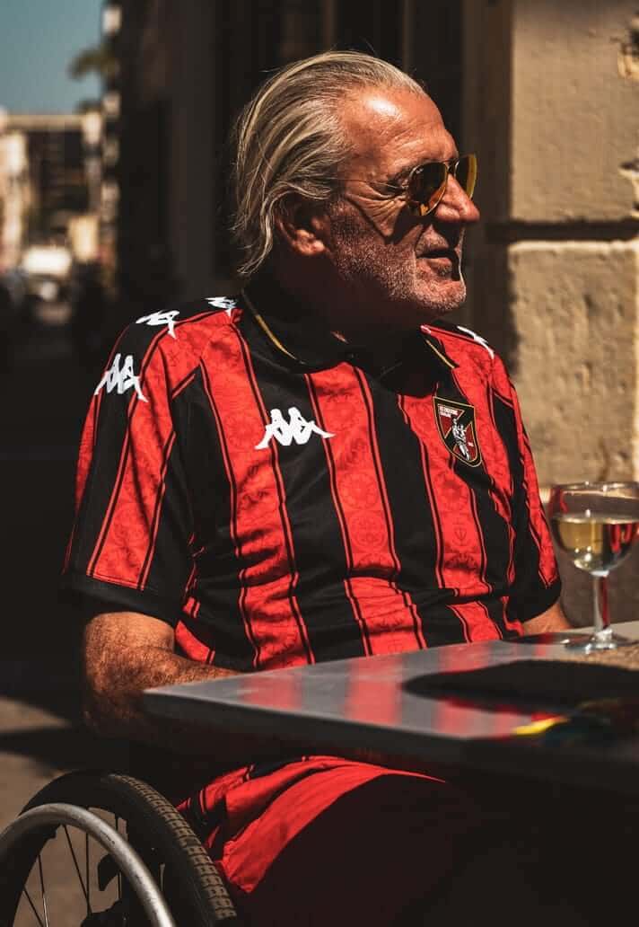
This year, that club is US Endoume. The Marseille side’s new 2026/27 home shirt arrives after the club celebrated its centenary in 2025, and it is immediately recognisable as the sort of thing Kappa does particularly well. Red and black stripes give it a traditional base, while the white Banda running across the shoulders provides the unmistakable bit of Kappa theatre. It looks old without looking retro, which is a considerably harder trick than football shirt design sometimes makes it seem. Kappa itself describes the shirt as joining tradition with renewal for a “mythical Marseille neighbourhood club”.
The real story, though, is inside the stripes. The red sections incorporate architectural details inspired by Notre-Dame de la Garde, the basilica that sits above Marseille and remains one of the city’s defining landmarks. Known locally as La Bonne Mère, or “The Good Mother”, it is visible across much of Marseille and has long carried a significance that goes well beyond architecture.
For Endoume, the connection is even more immediate.
“The Good Mother is the emblem of our neighbourhood, our club and of course our city,” explained US Endoume’s Head of Marketing and Communications, Julien Pacull. “It overlooks Endoume and the hill adjacent to our famous football field. It protects all the Marseillais. This is the reason why we decided to highlight it on our new coat of arms, on our new jersey, and at the heart of our communication as the identity symbol of our club.”
That is the difference between putting a local reference on a shirt because somebody in a presentation has decided every kit now needs a story, and designing something that actually belongs to the place it represents.
Notre-Dame de la Garde is not an easter egg here. It has become part of Endoume’s wider visual identity, appearing both within the shirt and on the club’s new crest. The architectural patterning gives the red stripes a depth you do not necessarily notice from a distance, which is probably exactly how it should be. Nothing needs explaining before the shirt works. The story simply makes it better.
The badge might be the best part.Football branding has spent much of the last decade travelling in one direction. Crests have been flattened, simplified and stripped of detail so they can function neatly as app icons and social avatars. Endoume have gone somewhere else entirely.
“This is a strong and assumed message from the club at the time of hyper minimalist logos,” Pacull said. “This new coat of arms proudly assumes its maximalism and retro style in tribute to the legacy of the club and the city.”
Good. There are obviously very sensible reasons why football clubs simplify badges, but somewhere along the way the idea of making something easier to reproduce became confused with making it better. Endoume’s new crest has detail, character and enough going on that you might actually want to look at it for longer than three seconds. On this shirt, surrounded by stripes, Banda tape and architectural references, restraint would almost have felt stranger.
It also fits neatly into what Kappa have been doing for some time.
For all the understandable nostalgia attached to the brand, this is not simply a company surviving on the memory of Juventus, Barcelona, Italy or skin-tight Kombat shirts. Its modern catalogue has become interesting precisely because there is no obvious house template running through all of it.
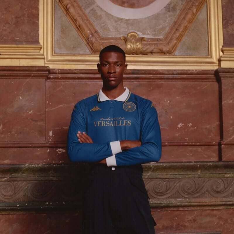
Look back at FC Versailles. Their 2025/26 range includes royal blue, white and gold, yellow, burgundy and some gloriously ornate typography that would be difficult to imagine surviving the first round of a multinational brand’s design review. The club liked its core shirts so much that it decided to keep them, describing the blue, white and burgundy trio as a visual signature it wanted to make “iconic and timeless”. More than 10,000 had been sold during the season, compared with just 300 across the entire previous campaign.
Espérance de Tunis offered something completely different. Their Kappa range moved between the club’s famous red and yellow, green and white, patterned royal blue and a much more restrained cream fourth shirt. OGC Nice had traditional red and black at home before moving through off-white and green into a blue pinstriped third shirt. Kappa’s own current catalogue shows how broad the company’s football portfolio has become, with clubs ranging from Fiorentina and Genoa to Versailles, Red Star, Espérance and Endoume.
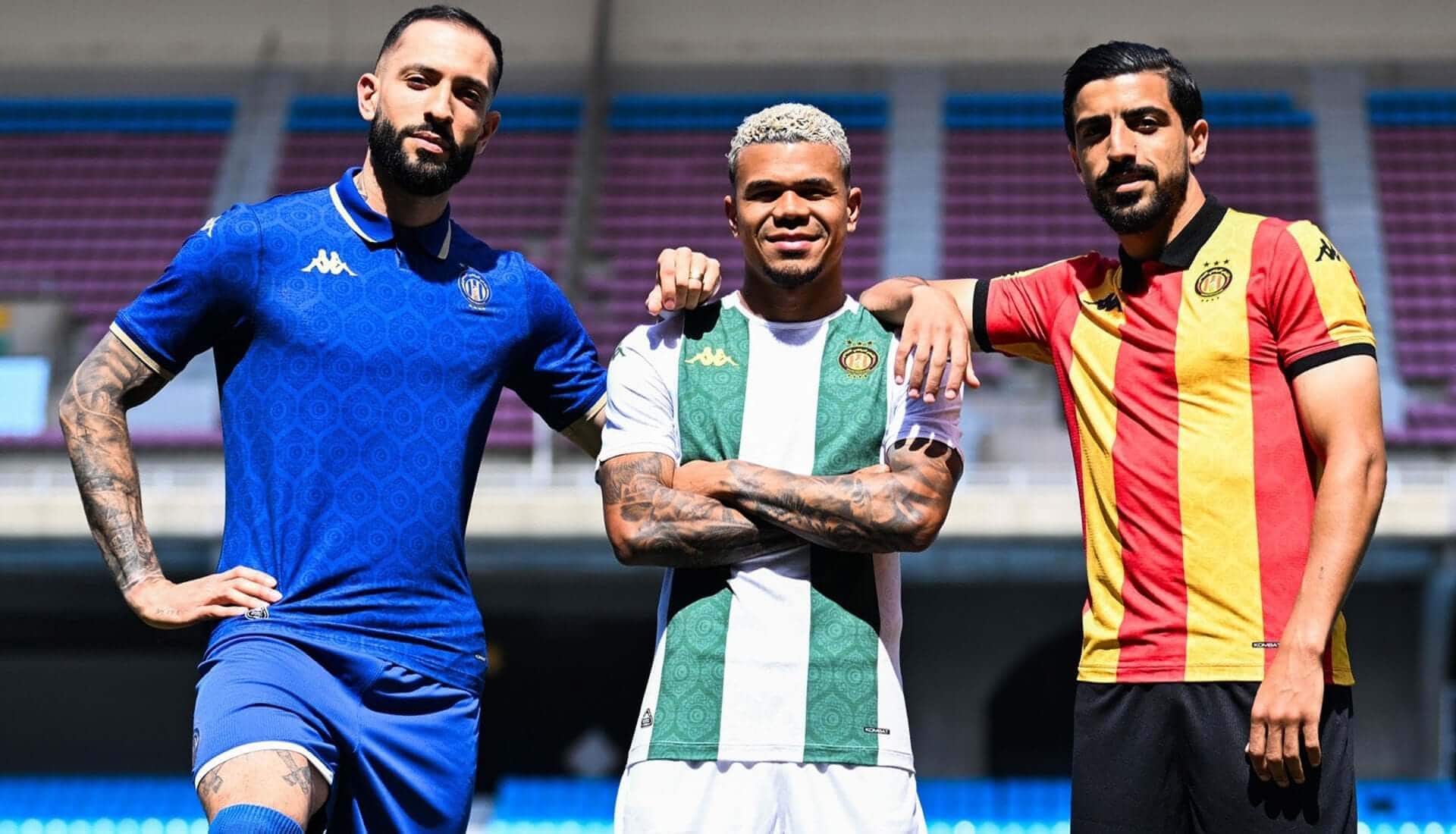
Kappa seem happy to let a club be strange. They let Versailles look like Versailles rather than like the French version of another team in the catalogue. They let Espérance produce four shirts that barely look related. Now they have allowed a neighbourhood club from Marseille to put a basilica into its stripes and launch an unapologetically elaborate crest at exactly the moment everybody else seems determined to remove another line from theirs.
That matters because the most interesting football shirts increasingly come from clubs with enough freedom to make something specific.
The biggest manufacturers still produce brilliant work, obviously, but scale creates repetition. When you are supplying dozens of globally important clubs, systems emerge. Collar shapes repeat. Templates travel. Seasonal ideas get translated from one team to another.
Kappa’s best work feels more difficult to predict. There is a reason the Endoume shirt immediately makes sense when photographed around Marseille. It does not need a campaign trying to manufacture a connection between shirt and city because the connection is already inside it. The colours belong there. The basilica belongs there. The crest belongs there. Even the extravagance feels appropriate.
And perhaps that is why Kappa keep pulling these out.
Football shirt culture is now enormous enough that the very best designs no longer need the very biggest clubs. A shirt can travel around the world before most people buying it have seen the team play a minute of football. Versailles proved that with buyers in 40 countries. Endoume may well do something similar.
The footballing ladder matters considerably less when a shirt is good enough.
And somewhere in Marseille, playing far away from the stages where football kit conversations usually begin, Kappa have made another one. Again.
You can shop classic Kappa football shirts on the marketplace in the Showboat app or on our website here.