Crimes against fashion have been committed. Repeatedly.
Tottenham (Home) - Nike
It's the same every season ain't it? Spurs have had AIA plastered on the front of their shirts since 2014 and every single home shirt has been identical. Nike, as manufacturers, need to show a little bit more creativity considering Spurs have a brilliant back catalogue. It really shouldn't be too hard to find some inspiration should it?

Brentford (Third) - Joma
A truly hideous bit of clobber. Three massive logos all in the centre of the shirt is something any decent designer would stay clear of. But it's the colour palette that moves this shirt from crap to horrific for us. The poor photographer had a job choosing a setting to make this look wearable. The stylist then put the players in trousers. Absolute crap from top to bottom.

Chelsea (Away) - Nike
Under normal circumstances you might think this is alright. This muted number is a visual rererence to the club's 1974-75 away shirt. They were dumped out of the FA Cup and League Cup that year. And relegated. Given the way their wingers are playing, you can't put it past them repeating that feat this season.

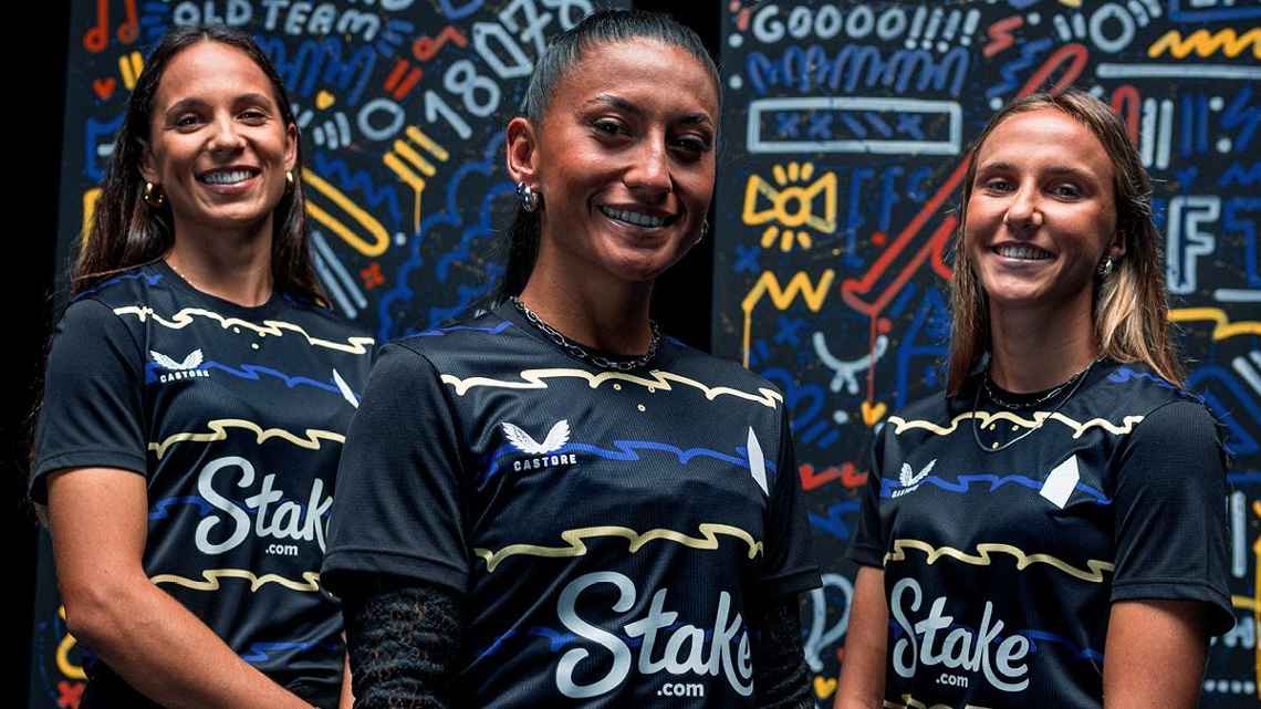
Everton (Third) - Castore
The press release for this one tells us this was designed by a local street artist famed for his murals around Liverpool. We're assuming it's not the dodgy Trent Alexander-Arnold one on the side of that pub. But we're less sure after seeing the shirt of wiggles "designed to invoke the ripples of the River Mersey."
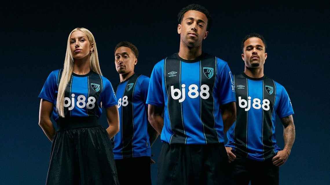
Bournemouth (Away) - Umbro
You can blame the sponsor - and we will - but this is a lazy effort from Umbro that looks like a 5-a-side template. But it's true that this shirt wouldn't be on this list without the car crash gambling logo. One more season and the gambling sponsors are gone, folks.
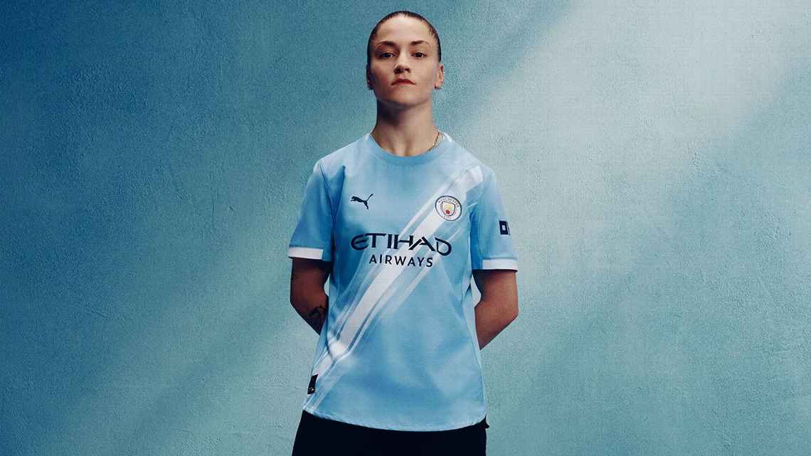
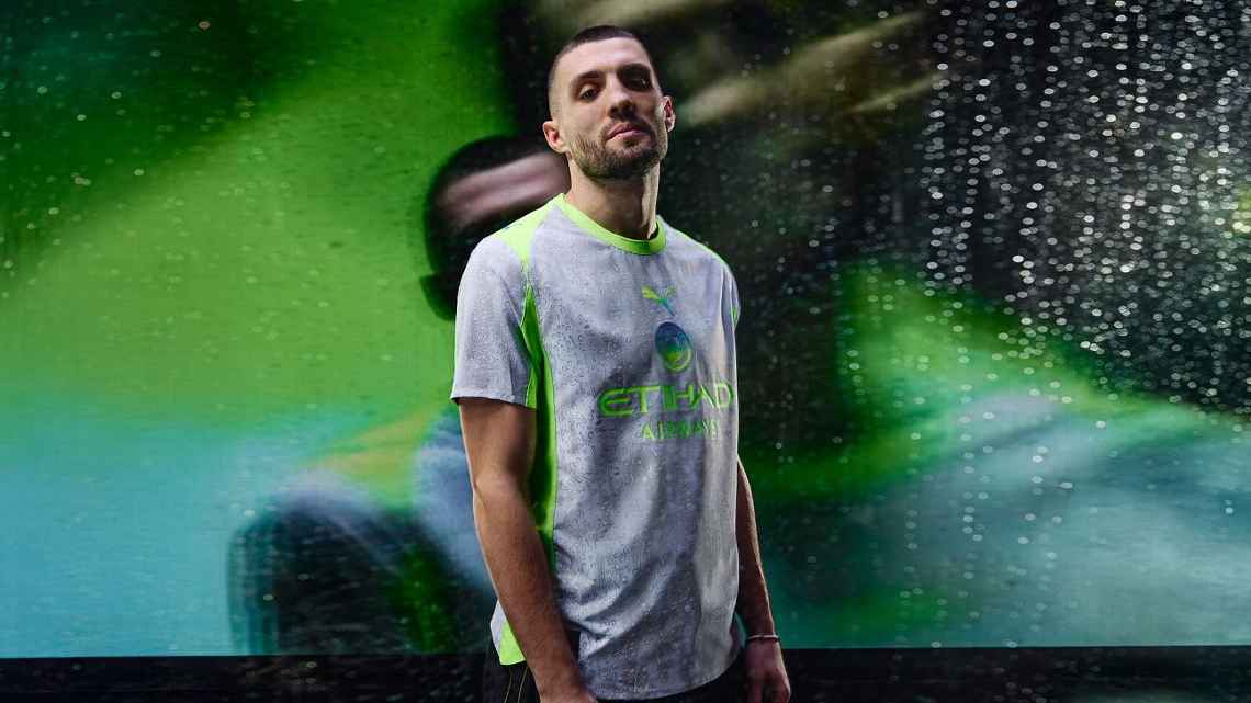
Man City (Home) - Puma
City are fast becoming the new Spurs. And we don't just mean crap at football. Every year they serve up the same old slop and slap a massive price tag on it. This year they've given us a bog standard sky blue shirt with a paint stripe on it for variety. In the bin.
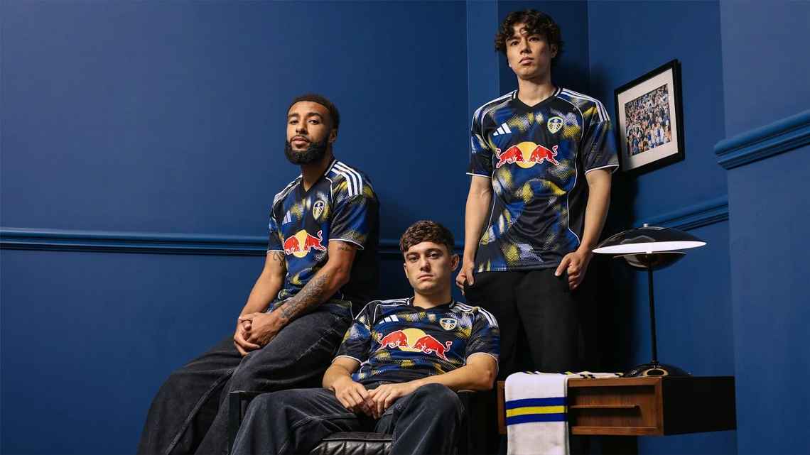
Leeds United (Third) - Adidas
Now, we don't mind an experimental third shirt. Let the designer have his very own acid trip for all we care. But this designer is in the back of your car, has drank one too many Red Bulls and made a mess everywhere. It's not quirky. It's not cool. It's naff.
Fulham (Away) - Adidas
Honestly, are they even trying anymore? We know Fulham don't have many fans but the poor sods wouldn't mind buying a nice football shirt once in a while, we're sure. How on earth can you have a set of fans living in one of the most expensive parts of London and serve them up a shirt that looks like it should be worn by Michael van Gerwen.

Man City (Third) - Puma
It's official. We've gone from 115 charges to 116. Relegate them. Sack the board. A line has been crossed.
We also think you'll like...