Venezia FC have some competition.
Pisa Sporting Club have quietly become one of the most interesting and stylish football teams in Europe, and their rise has little to do with trophies or global stars. What makes Pisa cool is how they’ve taken the essence of a traditional, historic club and reimagined it for a generation that cares as much about aesthetics, identity, and storytelling as they do about goals.
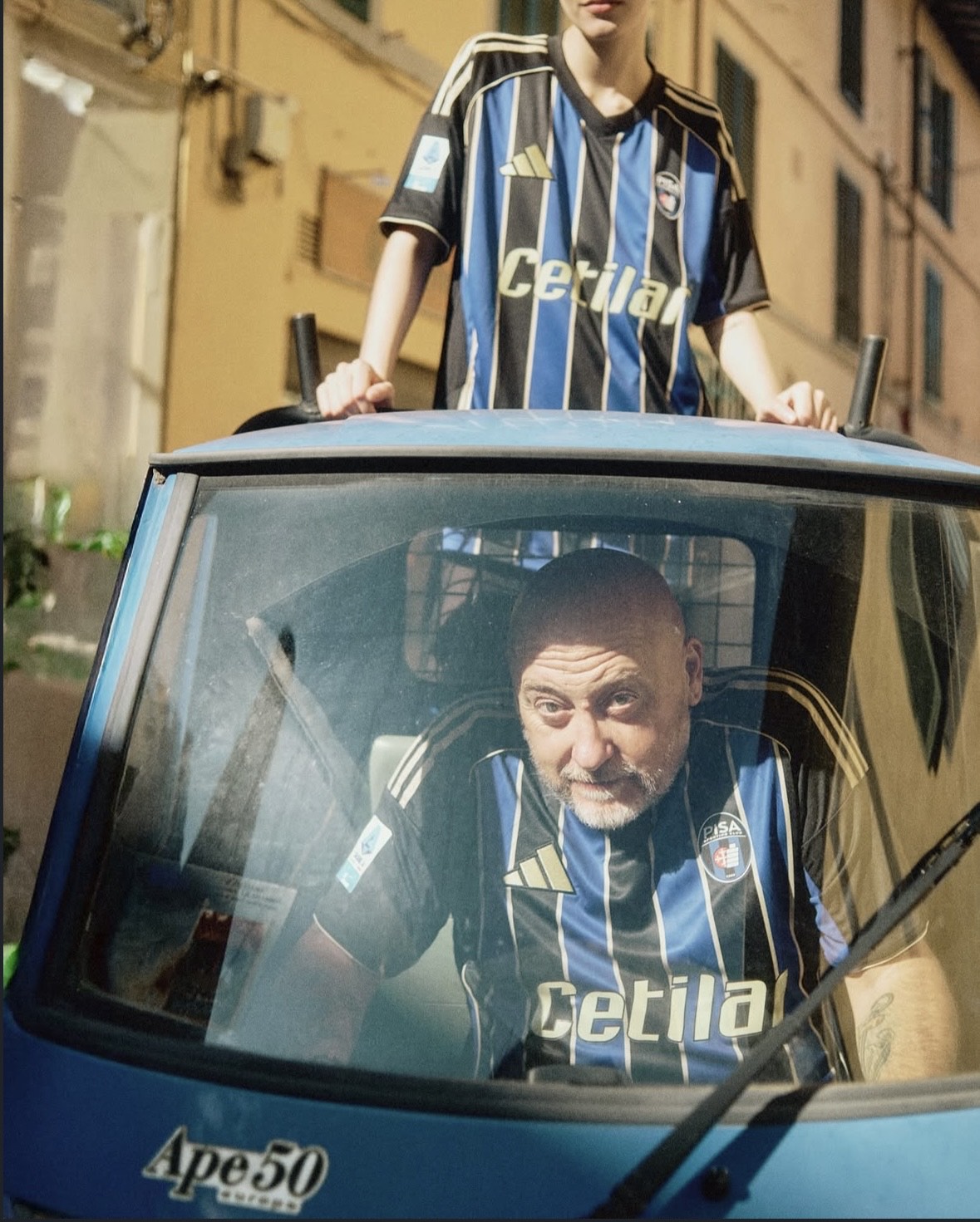
Their 2025–26 kits are a perfect example. The black and blue stripes of the home shirt remain, but there’s a new confidence in how they’re presented - gold detailing, a sharper fit, subtle design cues that make it feel closer to streetwear than standard sportswear. It’s the kind of jersey that looks just as good at a bar as it does in the curva. The away shirt flips expectations completely: a bold yellow that draws from the province’s colours, instantly distinctive without feeling forced. The third kit, white with minimalist gold accents, feels like something you’d see in a fashion editorial. Pisa aren’t just following the template of big-club design; they’re making choices that feel personal and crafted, the kind of details that appeal to people who notice typography, fabric texture, and colour theory.

That shift in tone isn’t accidental. Pisa’s leadership seem to understand that modern football fandom has expanded beyond the ninety minutes on the pitch. A club’s identity now lives on social media feeds, in collaborations, and in what fans wear day to day. The club’s recent campaigns speak to that sensibility - lifestyle photoshoots in Tuscan streets, limited-edition “match and lifestyle” versions of their kits, captions that sound more like fashion editorials than team announcements. They’ve clearly taken note of how Venezia FC captured global attention by blending design, heritage, and an outsider mystique. But while Venezia leaned into Venetian opulence, Pisa are channeling something different: understated, coastal Italian cool.
Part of what makes this rebrand work is authenticity. Pisa’s home shirt still carries the same colours that have defined them for over a century, and their crest hasn’t been sanitized into a minimalist logo. They’re innovating without erasing themselves. Even the storytelling behind the kits - the away’s “From the Citadel to the Sea” concept - roots the designs in place. This isn’t just a fashion project; it’s an extension of their geography, history, and ambition. The effect is that the club feels modern without feeling fake, stylish without losing soul.
Timing helps too. Pisa’s resurgence - back in Serie A for the first time in more than three decades - gives this aesthetic push a sense of narrative momentum. The look mirrors the moment: a club stepping back into the spotlight, sharper, more self-aware, and ready to be seen. Their kits, in that sense, are a declaration of intent. They signal that Pisa aren’t content to be just another provincial side. They want to be a club that stands for something - design, history, confidence, and a certain quiet Italian swagger.
In a football world crowded with branding exercises, Pisa’s transformation feels organic. They’re not trying too hard; they’re simply doing what cool always does - taking what’s already theirs and making it look effortless.

We also think you'll like...