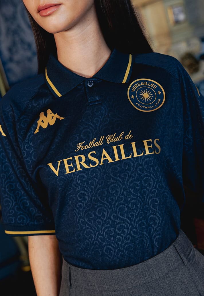
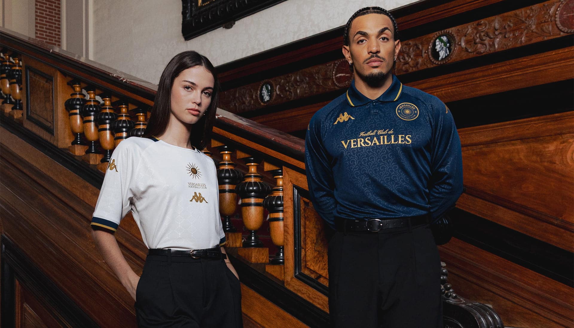
The new Kappa x Versailles shirts are beautiful. Of course they are. They have lovely collars, considered typography, subtle detailing and the sort of restrained colour palette that makes you imagine them tucked into a pair of trousers rather than worn with football shorts. The campaign is beautiful too: beautiful building, beautiful furniture, beautiful people. You could probably smell the Diptyque candle burning somewhere just outside the shot.
And yet, looking through the collection, it is difficult to escape one thought: haven’t we done this already?
The end of the nostalgia cycle
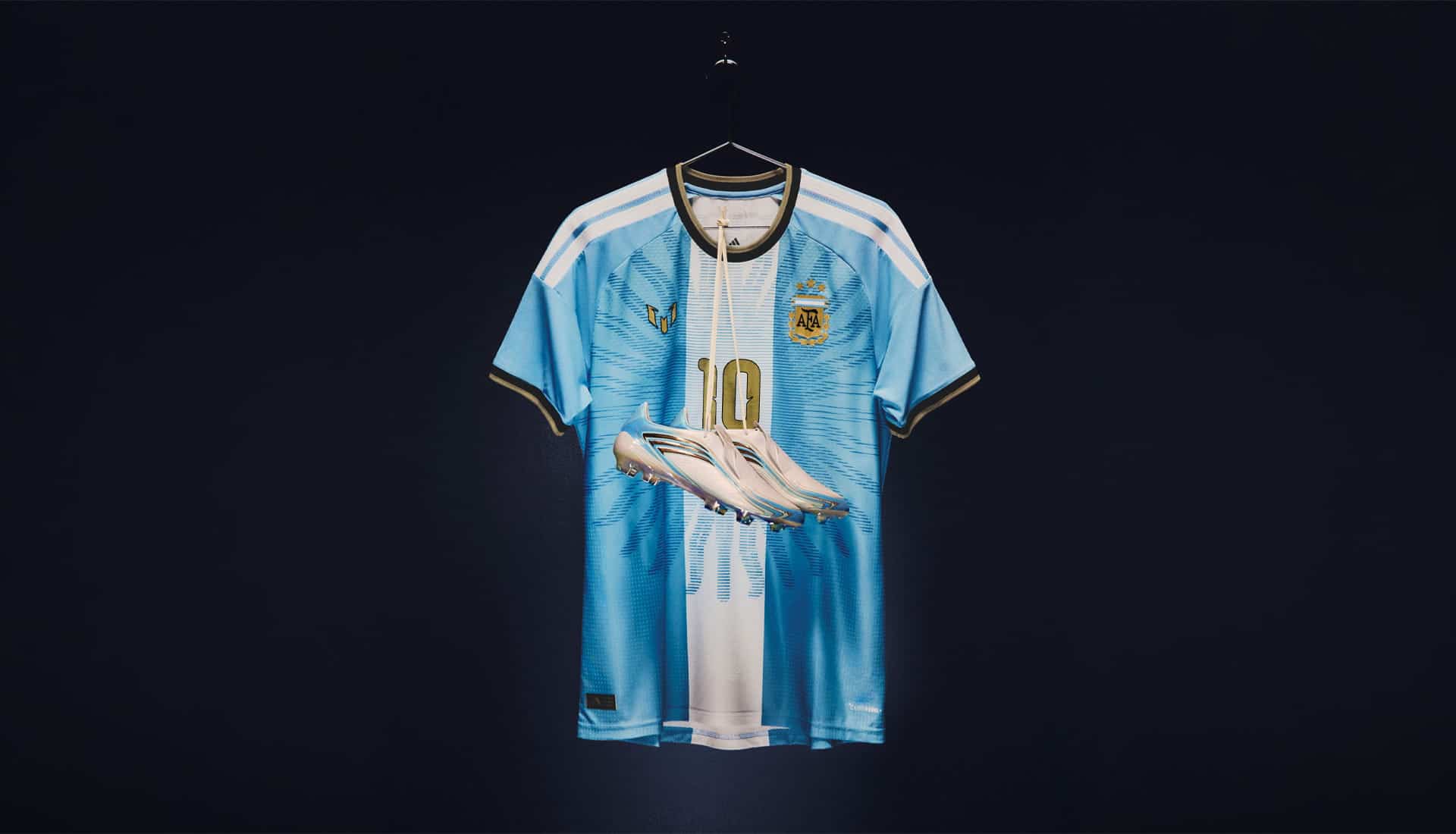
Football shirts have been through a remarkable creative period over the last decade, but much of it has been driven by looking backwards. Adidas have become particularly good at it. Trefoils returned, old templates were resurrected, archive shirts became reference points for new ones. Clubs rediscovered old badges, manufacturers rediscovered old logos and everyone discovered that a shirt vaguely reminiscent of something worn in 1994 was considerably easier to sell.
It worked because supporters genuinely wanted it. Football shirts are unusually emotional objects and nostalgia is a fairly powerful drug. But the problem with nostalgia is that eventually you run out of past, or perhaps more accurately, you start going around it for the second time. We’ve now reached the strange point where clubs are producing shirts inspired by shirts that were themselves inspired by old shirts. The reference has become the idea.
There are still wonderful retro-influenced kits being made, and there will be wonderful ones next season too. But simply opening the archive is no longer enough to make something interesting.
Then football discovered beautiful
The other great shift was aesthetic. For years, football shirts were judged primarily as football shirts. Then Venezia happened.
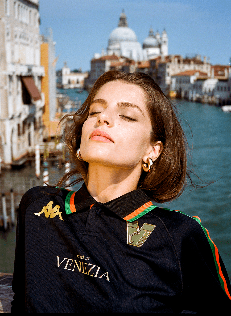
Kappa’s work with the Italian club became one of the defining football design projects of the early 2020s. Venezia suddenly existed somewhere between a football club, a fashion label and a particularly well-curated Instagram account. The shirts were gorgeous, the photography was gorgeous and people who couldn’t name a Venezia player suddenly wanted to wear Venezia.
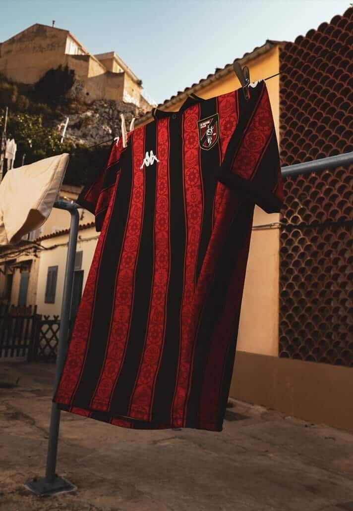
Others noticed. Athens Kallithea followed a similar path, while Versailles emerged with Kappa in 2024 and immediately understood the same visual language. Lower-league club, beautiful shirts, minimal sponsors, fashion-led styling, beautiful locations. It worked, but more importantly, it became replicable. What Venezia had stumbled upon as something genuinely disruptive gradually became a genre.
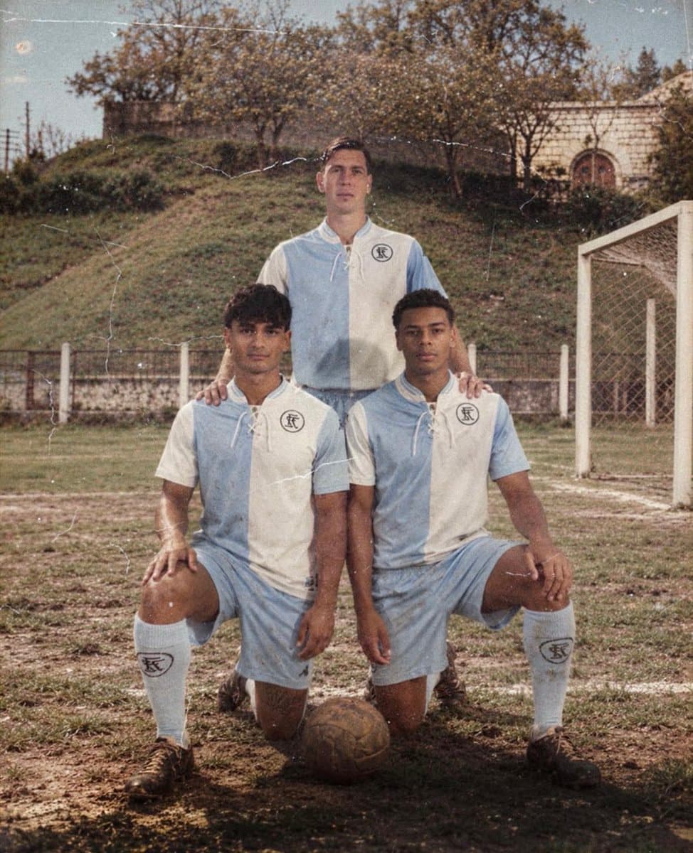
You know the photographs before you’ve seen them now. A footballer who looks suspiciously like a model. Loafers, tailored trousers, perhaps a chair designed by somebody Danish. The shirt is photographed somewhere that looks considerably more expensive than the stadium it will eventually be worn in. Again, it looks great. But that’s becoming the problem.
Versailles and the problem with getting it right
This is what makes the latest Versailles collection interesting. There is clearly proper design thinking behind these shirts. This isn’t a manufacturer scrolling through Pinterest for ten minutes before knocking something together on a template. Versailles and Kappa have consistently rooted their designs in the visual identity of the city, drawing on its architecture, royal imagery and history.
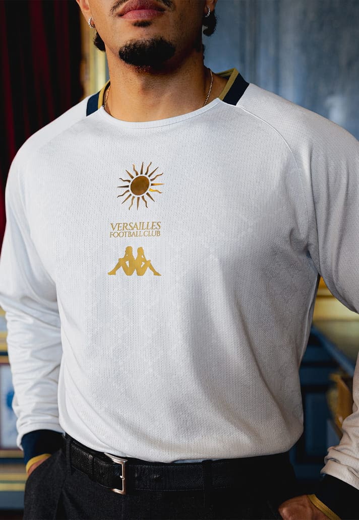
You can see the care, but you can also see the formula. Versailles now look exactly like we expect fashionable football clubs to look. In isolation, that’s a compliment. In the wider context of football design in 2026, it raises a more interesting question: what comes after beautiful?
Because we’ve been here before. Football spent much of the late 2010s and early 2020s rediscovering its own history. Nostalgia became the dominant visual language of the game, from remade shirts and retro badges to manufacturers digging old logos out of storage. It felt fresh until everybody started doing it.
Then beautiful became the differentiator. Venezia showed that a football club could behave like a fashion brand. Shirts became more considered, campaigns became art-directed and suddenly a second or third-tier club could command global attention simply by getting its visual identity right.
That felt fresh too. But now everybody knows the trick. It's like when you walk into a modern minimalist coffee shop and realise you could be anywhere. A London coffee shop is the same as one in Barcelona, Lisbon, Stockholm etc etc.
Originality is about to become expensive
So perhaps the next great football shirt won’t be beautiful at all. At least not immediately.
Think about many of the shirts we obsess over now: the Netherlands in 1988, Arsenal’s Bruised Banana, Denmark in 1986, Nigeria in 2018, the great goalkeeper shirts of the 1990s. They didn’t become interesting because somebody had successfully followed the prevailing rules of good taste. Some were strange, divisive. Some bordered on ridiculous. But they had an idea, and you could identify them from the other side of a room.
That is becoming increasingly valuable. Manufacturers have become extraordinarily good at producing tasteful football shirts. Technology has improved, design references are endless and everybody has access to the same enormous digital archive of football culture. It has never been easier to know what people think looks good, which paradoxically might make it harder than ever to make something genuinely new.
And originality is harder than nostalgia. Nostalgia gives you the answer before you’ve started. There is already a beloved shirt, badge, pattern or moment sitting in the archive waiting to be referenced. The new fashion-led football aesthetic comes with its own increasingly familiar rules too. Originality gives you nothing. You have to take a risk.
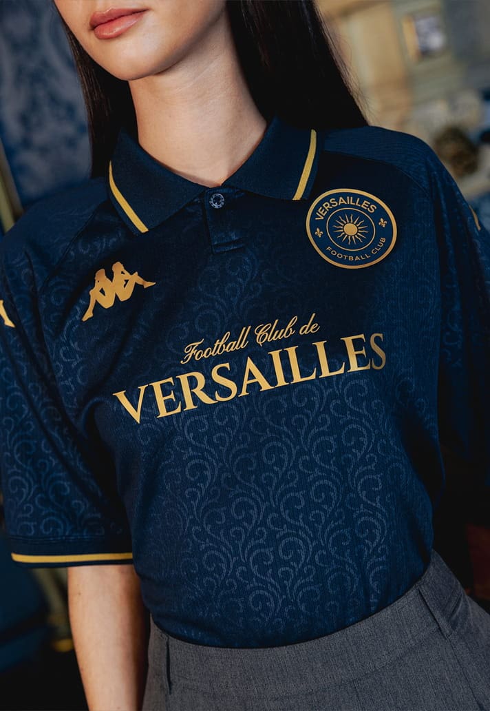
The next frontier isn’t another perfect collar, another 1990s reference, another old crest or another campaign photographed in a palazzo. It’s creating something we haven’t already been taught to like.
What comes next?
There is an irony in Kappa being the manufacturer that prompts this conversation because few brands have contributed more to modern football aesthetics. From the skin-tight Kombat shirts of the early 2000s to Venezia two decades later, Kappa have repeatedly understood that a football shirt can change the way we see the people wearing it.
That’s precisely why Versailles feels significant. Not because Kappa have made bad shirts, quite the opposite. They’ve become extremely good at making this kind of shirt. Maybe too good.
Football spent years rediscovering its past and then it learned how to be beautiful. Now comes the difficult bit: making something new.