Every football shirt tells a club's story, but the badge reflects its history.
That small embroidered symbol carries more weight than the rest of the kit combined. It’s history, identity, and pride - all packed into a patch.
In the early days, many clubs didn’t even bother with badges. Teams often wore plain shirts, distinguished only by colour. Crests were reserved for cup finals or special matches. When they did appear, they were usually based on local coats of arms, tying the club directly to the town or city. Arsenal’s cannon, Everton’s tower, and Chelsea’s lion all came from civic symbols rather than marketing departments.
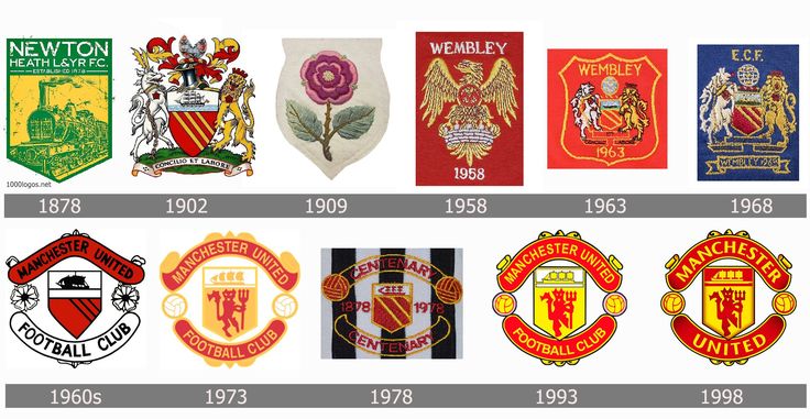
As football professionalised, badges became standard. The 1970s and ’80s saw crests shrink slightly to fit the new polyester era, often simplified for embroidery. This is when many clubs settled into the logos fans know today. Liverpool’s crest evolved to incorporate the Shankly Gates and eternal flames, tying the shirt to tragedy as well as triumph. Manchester United’s devil, added in 1970, was a deliberate branding move, giving the club a fierce new identity.
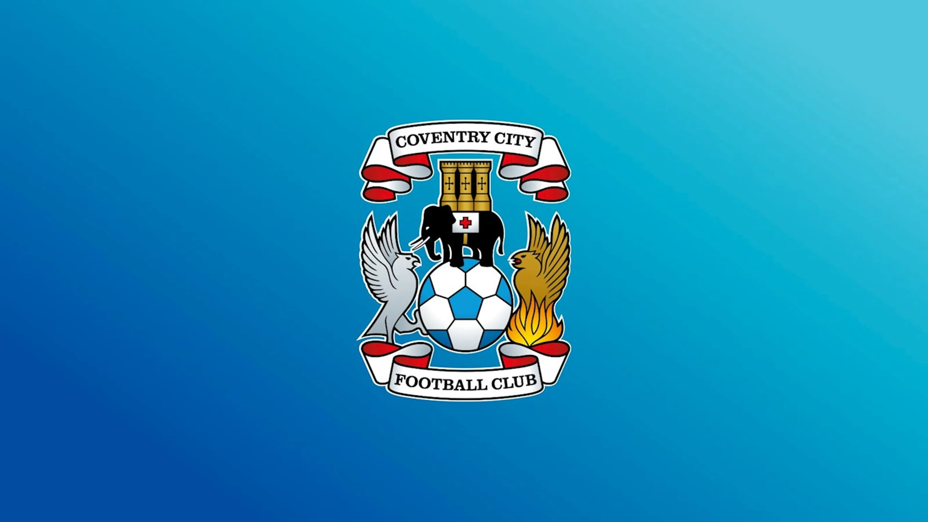
You've probably seen some club crests thousands of times and not noticed the brilliant details, even when it comes to the team you support. Coventry City's, for example, contains a phoenix - a nod to how the city rose from the ashes after being bombed during World War II. Following the bombing of the city, Nazi propagandists coined a new word in German, Coventrieren, meaning to raze a city to the ground, such was the scale of the destruction.
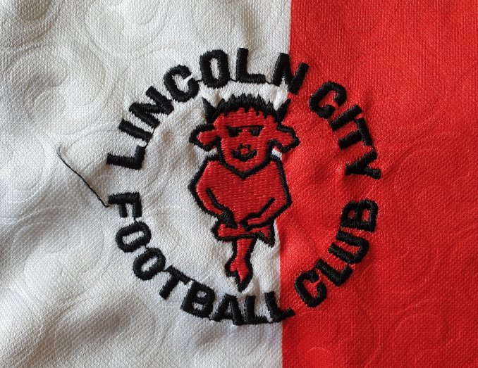
There are too many wonderful details found within club crests to feature in one article. English teams, of course, throw up countless idiosyncrasies on their shirts. Whitby Town FC’s emblem displays three ammonite fossils. These ancient marine creatures, related to today’s squids, are often unearthed in Yorkshire—the region where the club is based. Lincoln City go one further, and add the devil to their detailing. Their imp crest is a reference to devilish figure which is hidden inside the city’s cathedral.
In the 1990s and 2000s, badges became battlegrounds. Some clubs tried to modernise their crests for global audiences, stripping away detail for slicker, “logo-friendly” designs. Cardiff City famously changed their badge (and colours) under Vincent Tan, sparking fan protests. Leeds United’s 2018 attempt at a rebrand - featuring a bizarre “Leeds salute” cartoon - was so universally mocked that it was scrapped within days.
Yet the power of the badge remains. When Juventus unveiled their minimalist “J” logo in 2017, many were sceptical. But within a few years, it was clear: the new badge worked not just on shirts but on fashion collections, partnerships, and global branding. Football crests had entered the age of lifestyle marketing.
What hasn’t changed is their importance to supporters. A shirt can change colour, a sponsor can come and go, even the manufacturer can rotate. But mess with the badge, and you’re messing with identity. It’s the constant that connects generations, a thread running through every era of a club.
Badges may shrink, expand, or simplify, but they’ll never lose their power. They’re more than patches of thread or plastic - they’re the heart of the shirt.
We also think you'll like...