There was a moment in the early 90s when adidas decided football kits didn’t need to whisper - they needed to shout. Enter the EQT (Equipment) template. Between 1991 and 1994, shirts and shorts were smothered with oversized stripes, chunky collars, and the kind of bold positioning that made you wonder whether designers had spilt ink on the draft…but in the best possible way.
EQT wasn’t just a design; it was a movement. The heavy striping and daring layouts made clubs and nations look like they’d stepped out of a graphic designer’s fever dream. A template, yes. But lazy? Not a chance. When your blueprint ends up being fetishised decades later, you’ve clearly hit cult status.
Now, let’s revisit the teams that turned EQT into a mood board for football’s most gloriously oversized era.
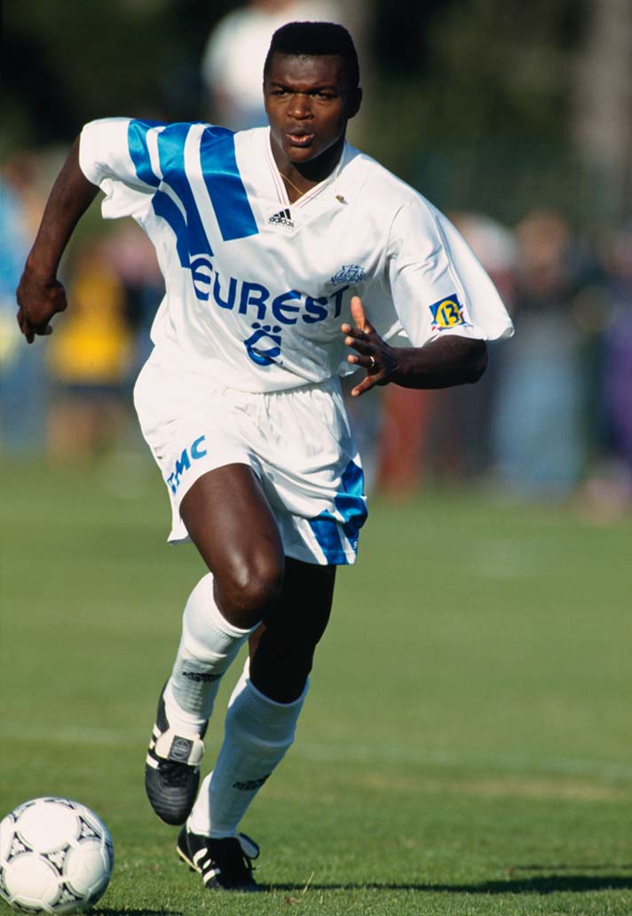
Marseille 1991-94
If Bayern’s EQT was about power, then Marseille’s was about pure style. This was a shirt that looked like it had walked straight off a Paris catwalk and onto the Velodrome pitch - oversized, elegant, and just the right side of flashy.
The base was a perfect, crisp white, the kind that made the Mediterranean sun bounce off it like a mirror. Then came those adidas stripes: a piercing sky blue so vibrant it could’ve been bottled and sold as Marseille Eau de Vie. The stripes slashed across the shoulder with zero subtlety, but somehow it still looked clean, almost minimalist in its chaos.
The details made it unforgettable. The adidas Equipment logo, dropped right in the middle of the chest like a stamp of authority, and the French tricolour flickering on the collar - a tiny flourish that gave it swagger without ever feeling forced. It was a design that didn’t need a sponsor plastered across the front. It spoke loudly enough on its own.
And of course, there was Chris Waddle. The Englishman glided around in this kit with his mullet flowing and shirt billowing, looking less like a footballer and more like a glam rock frontman moonlighting in Ligue 1. That imagery alone - Waddle, white shirt, big stripes, big hair - is enough to lock this jersey into the all-time EQT hall of fame.
Timing helped too. Marseille were a juggernaut in this period, culminating in that 1993 Champions League triumph, the first and only by a French club. This EQT design wasn’t just a kit; it was the uniform of European conquerors.
Oversized? Yes. Over the top? Absolutely. Overrated? Never. Marseille’s EQT was adidas hitting their peak template powers, a shirt that turned a football team into a work of wearable art.
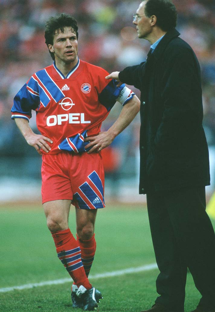
Bayern Munich 1992-94
If you wanted to understand the scale of 90s football shirts, you only had to look at Bayern Munich in the early EQT era. Every player looked like they’d raided the XXXL rail and just gone with it. Crests wandered halfway under armpits, sleeves swallowed elbows, and yet - somehow - it was glorious.
The design itself was pure EQT bravado. Those famous three stripes didn’t just sit politely on the shoulder; they swept down one side of the torso, then had the audacity to keep running onto the shorts. It gave Bayern this sense of motion even when the back four were standing still, as if the kit itself was dragging them forward.
The red and blue combination was unapologetically loud. Not the elegant, slim-cut Bayern red we’re used to now, but a carnival of colour in blocks and bars, the kind of thing that made you double-check the contrast on your TV. And yet, it fit the club perfectly - Bayern were the powerhouse of German football, and this kit screamed dominance.
It’s easy to laugh now at the sheer volume of fabric flapping around Mehmet Scholl or Oliver Kahn, but that was part of the charm. These were parachutes with sleeves, and they looked magnificent billowing across the Olympic Stadium. In an age before slim-fit tailoring, Bayern’s EQT kits turned excess cloth into a badge of authority.
For collectors, they’re still gold dust. Not just because of the design, but because this was a team that matched the swagger of the kit with silverware on the pitch. Bayern in EQT weren’t just playing football - they were striding through the 90s like kings in technicolour armour.
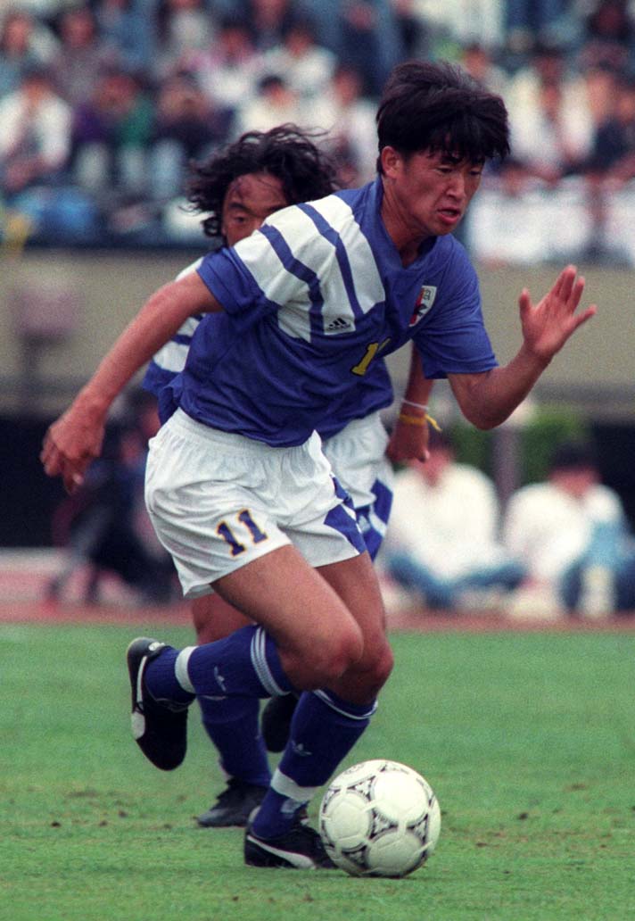
Japan 1992-94
Japan’s EQT effort was the kind of shirt that stopped you mid-scroll in a collector’s feed - simple at first glance, but stacked with little quirks that made it stand out. No sponsor noise, no unnecessary clutter, just that dazzling block of white space punctuated by adidas’s three-stripe thunderclap on the shoulder. And then came the twist: the performance logo cheekily planted on one of the stripes. A tiny move, but pure genius. Suddenly the shirt felt more experimental, more daring, more Tokyo streetwear than suburban Europe.
The fit followed the early-90s gospel: unapologetically boxy, sleeves generous enough to cover most of your forearm, and a collar that looked like it had been pinched from a school uniform. On the pitch, it gave Japan a striking silhouette - angular, oversized, and somehow both strict and flamboyant at the same time.
It also arrived during a pivotal moment for Japanese football. The national team was still finding its footing on the international stage, with the J-League about to explode into life in ’93. This shirt felt like the dress rehearsal for the boom - a statement that Japan weren’t just passengers in world football, they were about to become a serious act.
In hindsight, it’s a cult piece. A clean design with one clever twist, oversized in all the right places, and just enough flair to separate it from the European EQT pack. Minimal, but never boring - the Japan 1992 EQT kit was an early hint that when it came to football fashion, Japan had the chops to play with the best.
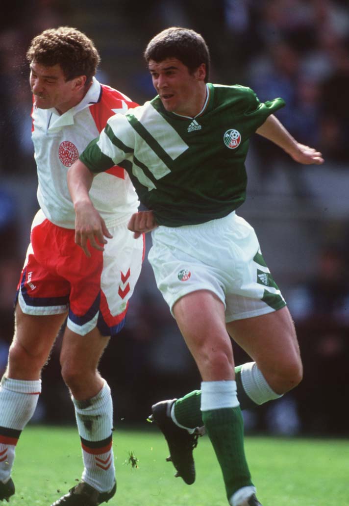
Republic of Ireland 1992-94
Ireland’s EQT kit was peak 90s energy: sleeves wide enough to hide a small family, stripes chunky enough to be seen from space. This wasn’t just a football shirt, it was a canvas for national pride. No sponsor logos barging into the party - just that deep, unapologetic green, carved open by adidas’s three-stripe thunderbolt across the shoulder.
It looked powerful on the pitch, but it also worked because of the timing. Ireland were riding high, with Jack Charlton’s team punching above their weight on the international stage. In this shirt, they carried a whole nation’s swagger into battle. Pub walls were covered in it, schoolyards were filled with kids in bootleg versions, and suddenly the EQT design wasn’t just German minimalism - it was part of Irish football folklore.
Oversized? Definitely. Boxy? Without question. But when you saw Paul McGrath patrolling the backline in a shirt that could double as a tent, it didn’t feel clumsy. It felt iconic. The 1993 Ireland EQT kit wasn’t just a uniform - it was a declaration: this small island had arrived, and it was making sure you noticed.
Liverpool 1991–93
Liverpool’s EQT kit wasn’t just a football shirt, it was a time capsule of early Premier League swagger. The design carried two of the most iconic sponsors ever to grace a football chest: Candy and then Carlsberg. One was all neon tracksuits and VHS adverts, the other the longest-running sponsor partnership in English football. Same template, two different eras of cool.
The shirt itself was everything you want from early-90s adidas chaos. The three stripes crashed over the shoulders like racing stripes, bold enough to slice through the television static of a grainy midweek match on ITV. The fit? Utterly massive. Shirts ballooned out like parachutes as players sprinted down the wing, sleeves dangling past elbows, collars standing tall like armour.
And yet, despite its bagginess, it looked sharp. The red was rich, almost regal, and the detailing carried a kind of futuristic minimalism that still holds up today. This wasn’t a kit that whispered tradition - it shouted that Liverpool were stepping into a new era, bridging the old First Division dominance with the birth of the Premier League.
Moments matter too, and this kit got them in spades. From John Barnes gliding past defenders to Ian Rush adding to his ridiculous goal tally, this was a shirt that witnessed transition but never compromise. It’s why so many fans still rank it in their personal top tier of Liverpool shirts - because it symbolised continuity, change, and style all at once.
Oversized, over-the-top, over everything - Liverpool’s EQT kit was 90s football in fabric form.

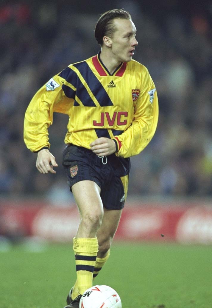
Arsenal 1992-93
Adidas weren’t content with just slapping three stripes across the shoulder and calling it a day - not when Arsenal were involved. The Gunners’ EQT kit was a remix, a twist, a rebellious cousin of the standard template. Instead of stripes cascading from the top down, these scarlet bolts erupted from the hem, climbing the shirt like ivy scaling Highbury’s famous brickwork.
It was a bold choice, and it worked. This was the kit of George Graham’s Arsenal: disciplined, steely, and ruthlessly efficient, yet somehow draped in one of the most adventurous adidas looks of the era. The deep red, the white sleeves, the climbing stripes - it all came together to form a kit that felt both forward-thinking and unmistakably Arsenal.
And let’s not forget the memories stitched into it. The 1993–94 season ended with Arsenal conquering Europe, lifting the Cup Winners’ Cup in Copenhagen. Images of Alan Smith’s winner against Parma are forever tied to this shirt - a moment that elevated it from template tweak to cult classic.
It was oversized, sure, but there was a swagger in that looseness. Watching Tony Adams marshalling the back line in a shirt that flapped like a flag was poetry in polyester. Arsenal’s EQT wasn’t just a kit; it was a statement that even in a world of templates, the Gunners demanded their own flavour.
We also think you'll like...