‘Bad design is smoke, good design is a mirror.’ It’s a line we’ve come back to when thinking about Drake Ramberg’s body of work for Nike. His work was bold, innovative, and seemed to encapsulate what made the 90s great. His designs gained widespread acclaim years after their release because, as is often the way, it’s only afterwards that we see the true worth of things. Drake was able to catch lightning in a bottle for the clubs he worked with and the brand he worked for. He also added to the culture that made the 90s unique and, unsurprisingly, is back in fashion once again. Our editor, Lee Kelleher, sat down with Drake to chew the fat.
Hi Drake. What was your knowledge of football before you arrived in Europe to design shirts for Nike?
I was probably just this ignorant American. I didn't know Man United from Man City. In America, we had no real exposure to football in the late 80s and 90s. There was a programme on public television when I was growing up called Soccer Made in Germany. It was on Sunday mornings, an hour or two of some German football game, and that was about all I saw, except for, you know, the World Cup. I'd go to [Portland] Timbers games occasionally, but it really wasn’t until I arrived in Europe that I started to get a full understanding of all these huge clubs with their 100-year histories.
Were you looking at fan culture and history when you came to designing shirts?
Totally. You know, being a designer, you take all of this information, all this data, and you just kind of plug it into your brain. You wander the streets, you get a feel for the city. And it wasn’t just me, we had the apparel designer, a developer, product leaders, project managers; we had people on the ground in France or Germany who fed us the basic information on the dos and don’ts, and helped us better understand the history and the brief. We went to Highbury, we met the players, the leaders of the club, the kit guy, the fans. It was a challenge, but a great opportunity to carry out an anthropological dig, to figure out the culture of each club and really understand it.
You once described design as telling the club’s story through graphics. How does that process change if you're working with a club with a strong tradition like Arsenal versus Dortmund, who I guess felt more like upstarts?
Yeah, each one is different. There's no formula other than to do right by them, be authentic, and celebrate a story that maybe hadn't been told. Maybe it's in a really fun way, or maybe it's in a very bold, expressive way, but you have to do your research and understand what's appropriate. Any concepts we came up with were vetted through months of internal reviews with Nike. You do the research and stand behind your concepts. We would go out and pitch it to the club, and hopefully they saw that we did our research, that we understood them, that we nailed it, and that they loved it, otherwise, it was back to the drawing board. Most of the time, I think we were pretty close to the target.
How do you take a concept and translate it into a jersey?
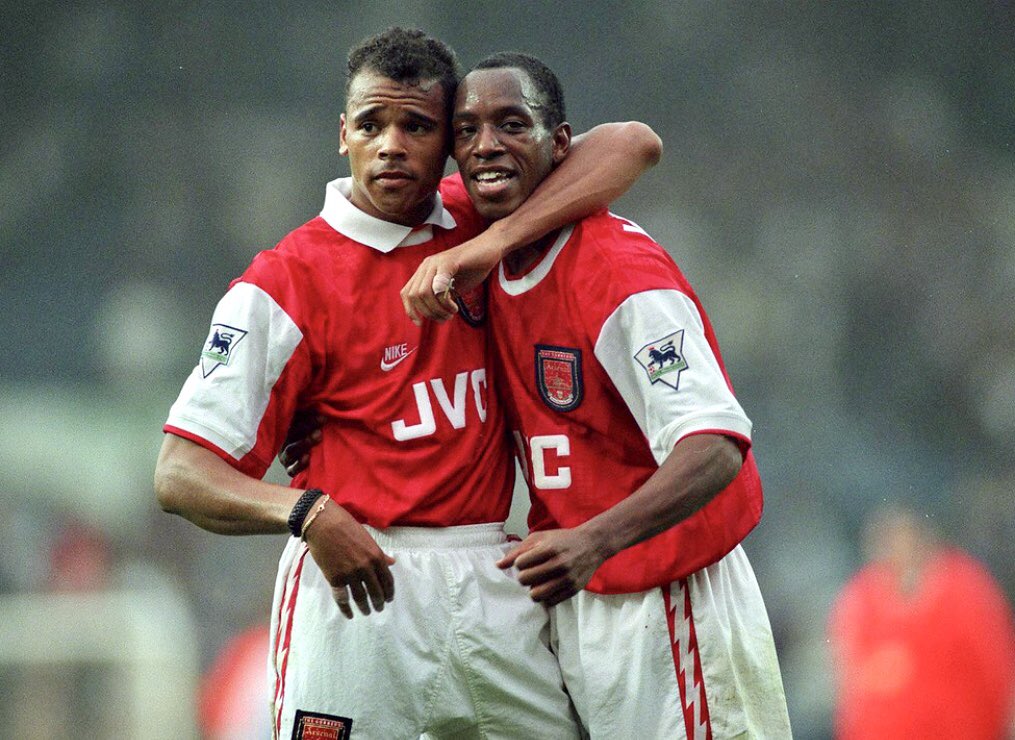
Well, you know, that's the art of it. With the Arsenal shirt, the first one we did in 1994, we knew the basics: it had to be a red shirt, white sleeves, white shorts, and the original crest with the cannon on it. I knew they were the Gunners, but you don’t really see the word Gunners on any of their products. So why not have the word over the crest? I thought the fans would love it.
I decided on a lightning bolt as a more dynamic, expressive way to show an arsenal. When you think about it as a cannon or a place where artillery is stored, right? But you want it to become more than a place, it’s more of an action. So, a lightning bolt just felt like, I don't know, the blitzkrieg or something. It felt appropriate and more dynamic than what they'd been doing in the past.
And then it was kind of cheeky to put “Arsenal” on the arse, you know. But the club thought that was clever: “Arsenal” across the back tail of the shirt, which played off a silhouette we adapted from tennis polos. The longer tail kept it tucked in during play, but we also turned it into a graphic space. At the time, that was pretty new. I think it put a stamp on what Nike was going to bring to the industry.
We used to joke that if you put a collar on the shirt, then the fans could wear it to the pub and to church. Ian Wright was known to cut the collar off his Arsenal shirt because he wanted to make his own statement. He liked it better without the collar and, honestly, I kind of liked it without the collar too [laughs].
Did you ever think that football shirts should be timeless or is their value in embracing the current moment even if they look dated later on?
We weren't trying to have it last forever. But, we also weren't trying to chase a trend or make it fashionable for the street. At Nike, we always said that fashion was the F-word. We never wanted that to be our driving purpose. If it's authentic, if it performs right for the athlete, and if we use insights to come up with something truly relevant to where that club is and what they're looking for, then that was the goal.
Why are we so nostalgic for 90s kits in particular?
Well, I think we're kind of getting back into that golden era again because of the love for that time. In the late 90s and early 2000s, things got cleaned up in the market. It's cyclical. We moved away from a lot of the bold graphics, and kits became more about colour blocking and cleaner designs.
But in the 90s there was such amazing storytelling. The goalkeeper shirts of that era, the characters, the personalities, the Cantonas, the David Seamans, the Ian Wrights, all those guys. There was a real love for the game back then, and the jerseys themselves were bold and fun, with bright colours and strong graphics. I guess that’s why people look back at that era so fondly.
There were no third jerseys, really, in that era. It feels like third jerseys are now experimental canvas. Is that what goalkeeper shirts were then?
Oh, there were no rules! [laughs] I don't think they even put them on retail. When I started, they still had padded elbows, quilted fabrics, even sticky screen prints on the chest to help grip the ball. Some keepers wore long pants, mock turtlenecks, things you’d never see on outfield players. Leadership was really concerned about the outfield shirts. Goalkeeper jerseys were different.

Home or away? Away kits have a lot more freedom, but home is a bigger challenge, that’s the one that’s most iconic and really the symbol of the club. So, I think if you’re a real designer, you want to take on the biggest challenge and do it in a beautiful way that just blows people away.
Sponsor or no sponsor?I like the purity of a shirt without a sponsor, but that's not reality. National teams are fun because you don't have to worry about a sponsor, so that’s more of a pure, enjoyable design assignment. It used to drive me nuts with PSG that they would have different sponsors for every tournament, and then they had this big old sponsor that just covered up the design. But some fans look back and see it as part of the uniform now. In my heart, I think a lot of the time they make the shirt a little bit uglier because they cover up the design. But I've learned to live with it.
And finally, what’s the shirt you wished you designed?I didn’t get to work on the Brazil national team shirt in 1998, that would have been a cool one. And the USA national team that would have been cool to be able to riff on.
We also think you'll like...